Hi, I'm Angela Blumen (aka Fanfaretti) and I am a freelance art director and graphic designer based in Amsterdam. I create visual identities, websites, books, magazines and creative concepts.
TEDS – All Day Brunch Recipe Book
Art Direction, Layout, Concept, Photography
2025
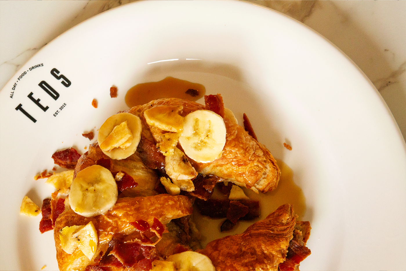
After rebranding Teds, I got offered to also create a recipe book for them! I did the concept and design, alongside a photoshoot of their iconic dishes. The overall concept is that the food needs to be drippy, over-the-top and really lekker. The book is published by KOSMOS publishers. Writing by Sanne Huisman (owner), food styling by Agnesa Ruse.
You can purchase ithere.
Stenfix
Art Direction, New Branding
2025-2026
(Work In Progress) Stenfix is a Swedish craftsmanship company that fixes broken stone counters.
Fanfaretti Magazine #2
Publishing, Art Direction, Layout
2025
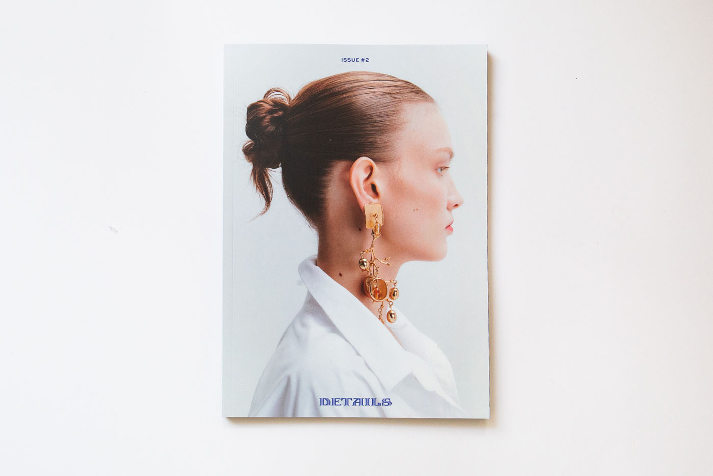
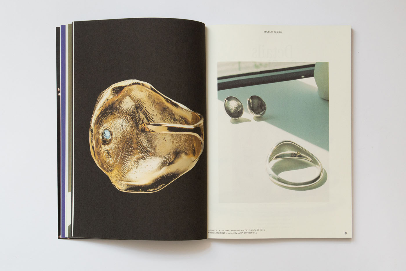
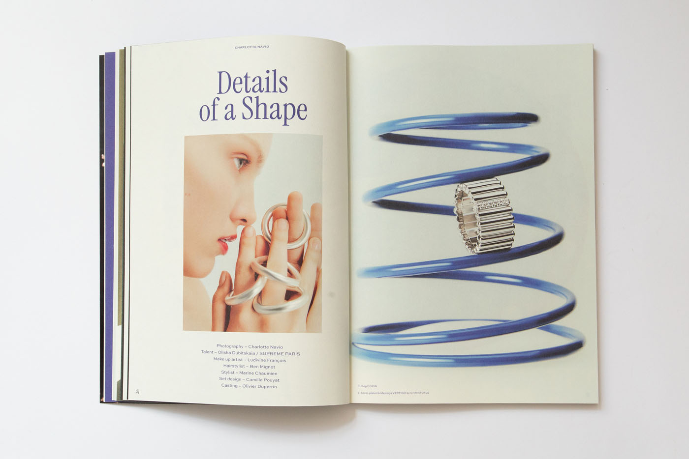
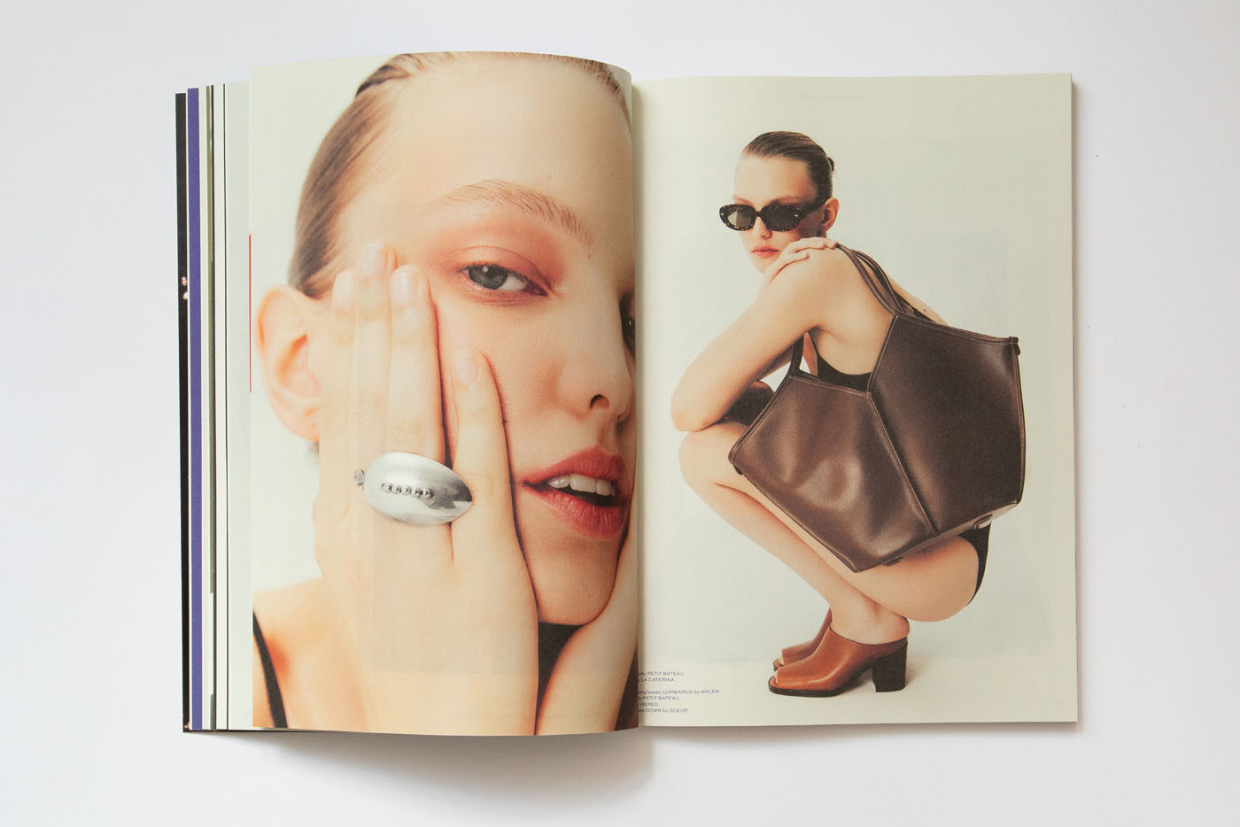
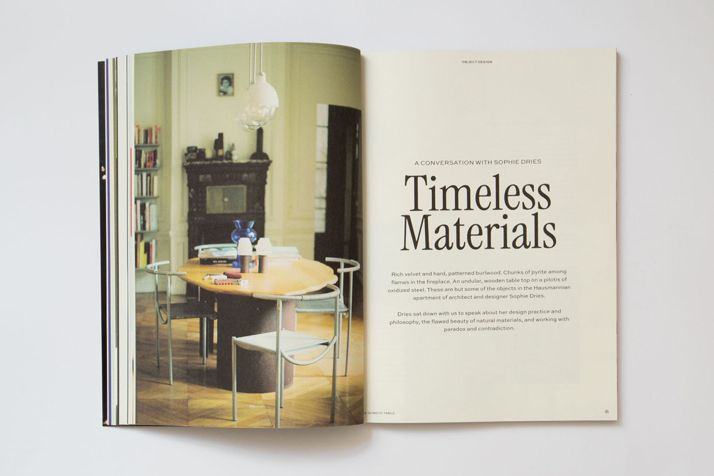
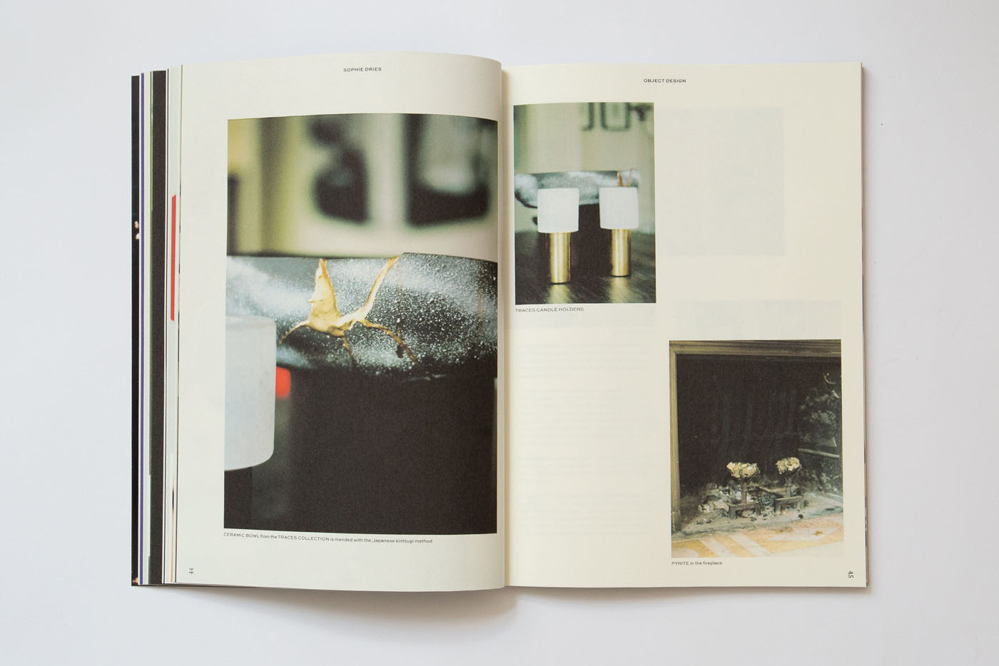
Fanfaretti Magazine is mine and Laura's independent publishing project. I collaborate with & commission a variety of artists, photographers and creatives who work on one specific theme for each issue. Laura does all the text-editing and most of the interviews. We also collaborate with writers and contributors, who help us conduct the interviews. I then design, publish and host a launching event.
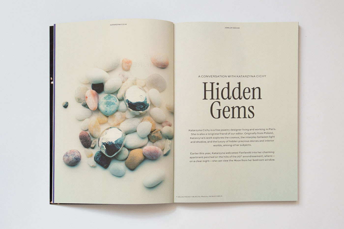
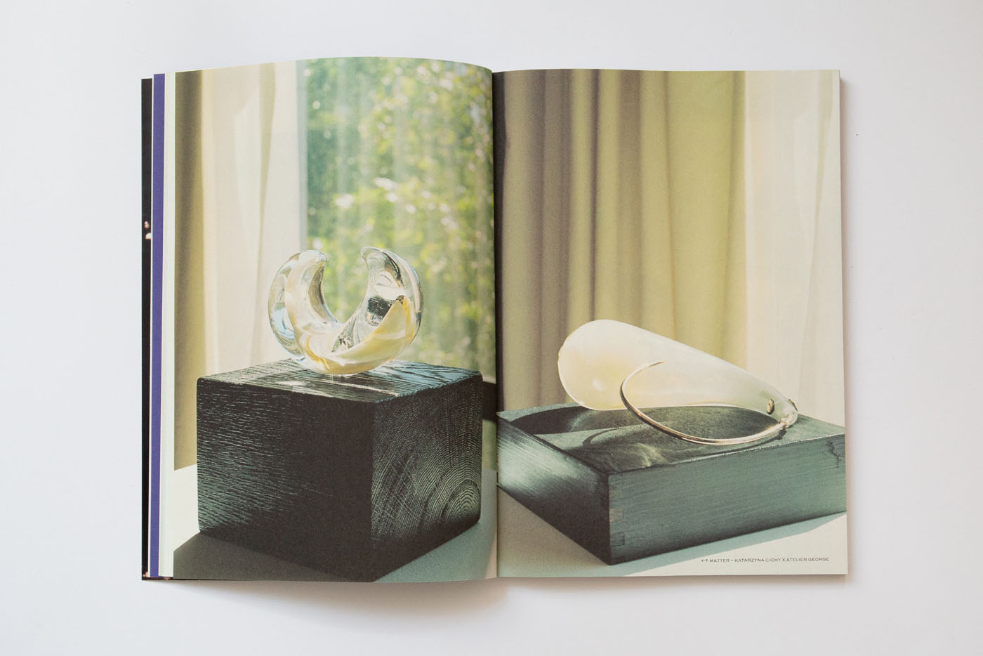
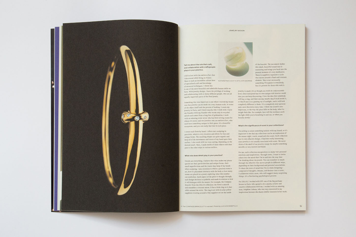
Second issue's theme is DETAILS, focussing on the creatives of the city of Paris. Contributors: Sophie Dries, Charlotte Navio (Cover Image), Katarzyna Cichy, Lucas De L'Estang, Beatrice Olimpia Bonato, Emanuel Hugot, Caroline Corbasson, Céline Jouandet. Text-edit by Laura Josephine O'Brien. Limited edition of 100 copies. Printed on Munken Paper in Culemborg, the Netherlands. 124 pages, perfect binding. Hand-stamped with silver.
Available at Athenaeum Amsterdam, Yvon Lambert Paris, PaperCut Stockholm and at Et Studie, Copenhagen.
TEDS – All Day Brunch
Art Direction, Re-brand, Photography, Execution, Social media
2025 - ongoing
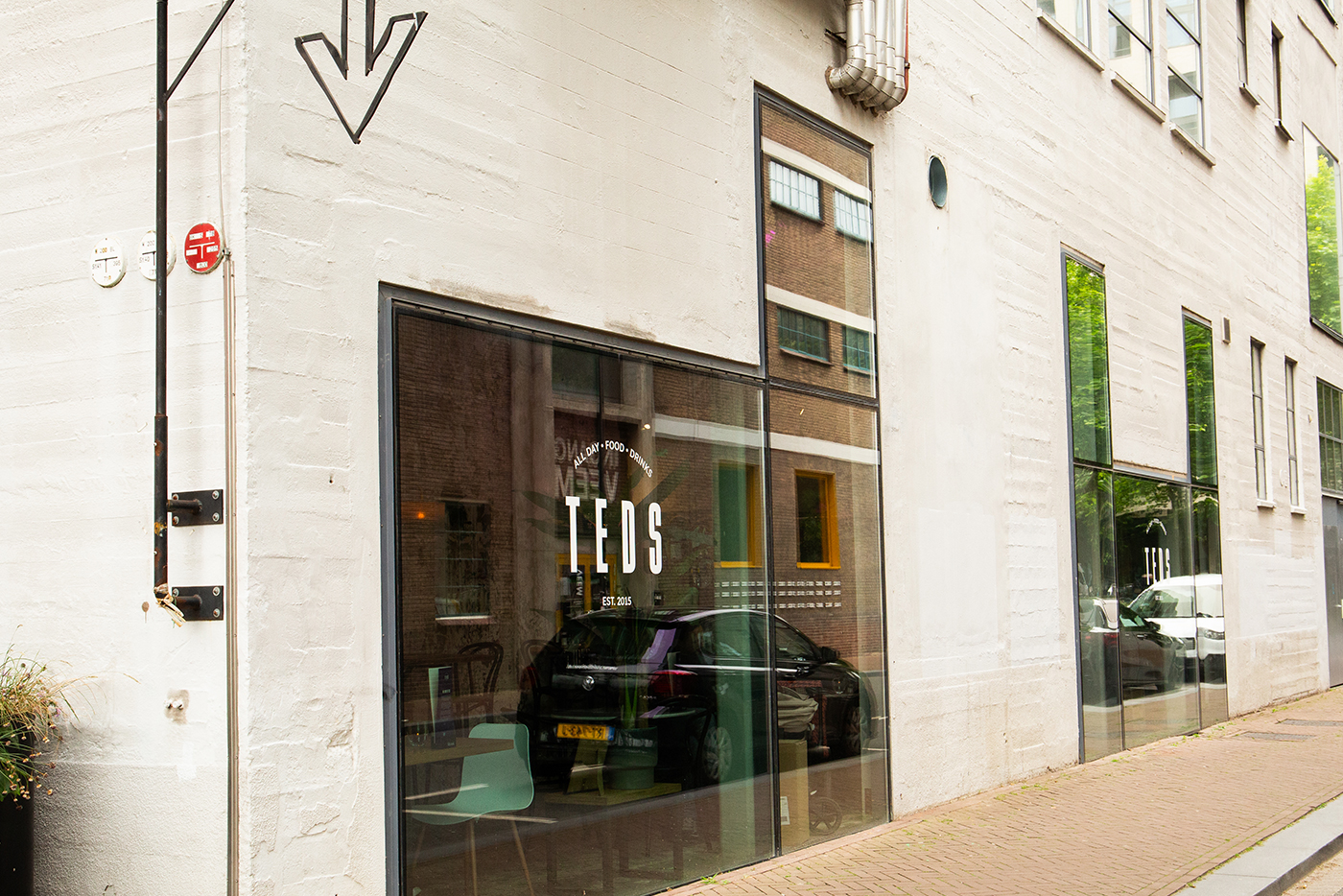
(Work In Progress) I got the chance to update the visual identity and visual language of Teds – All Day Brunch. The refresh of the brand consisted of new logo + payoff, new website, a broad range of printed matter like posters, postcards, small business cards, social media and more!
MR MARVIS Newsletter E-com
Art Direction, Filming (Super8 Video)
2024
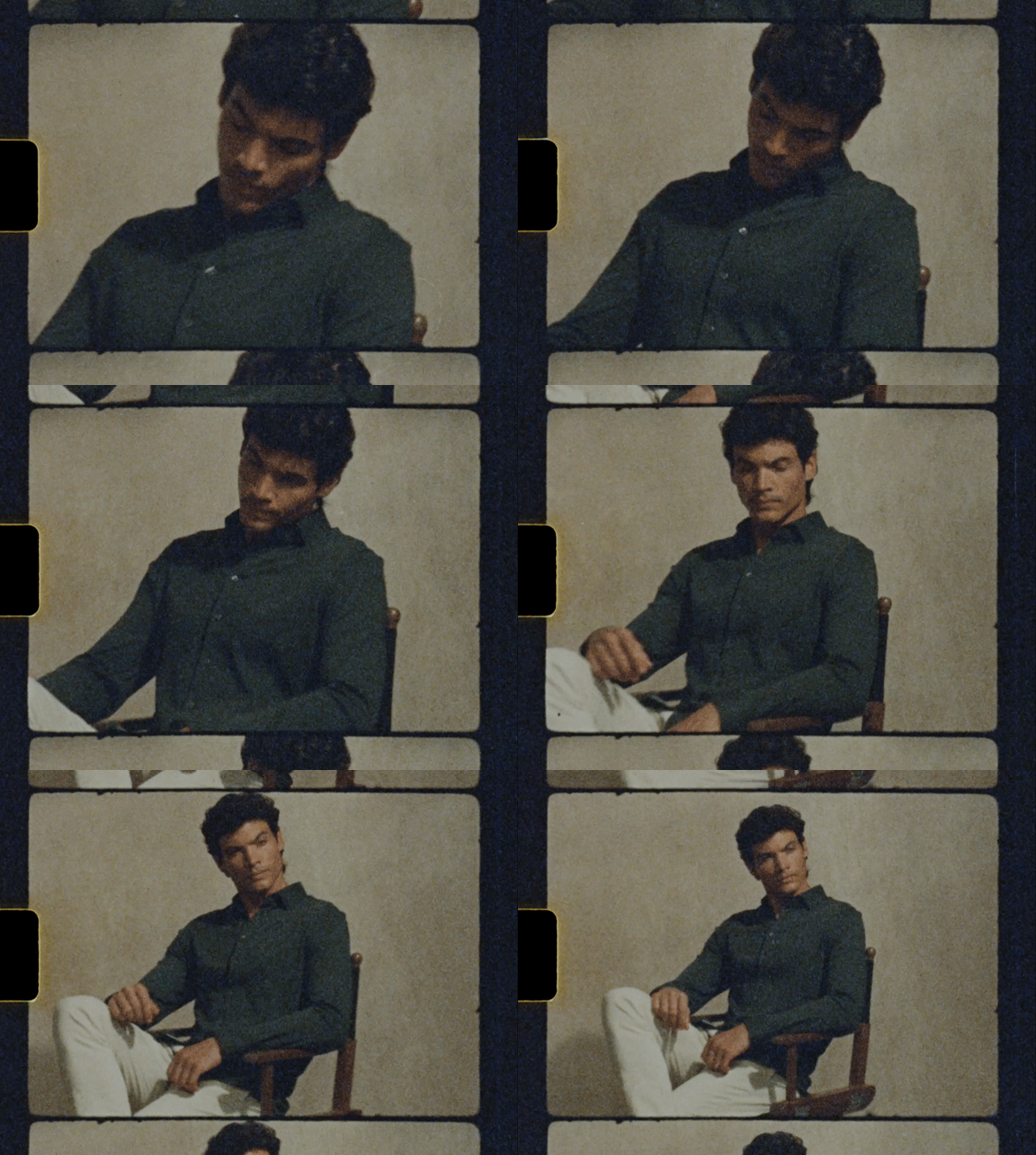
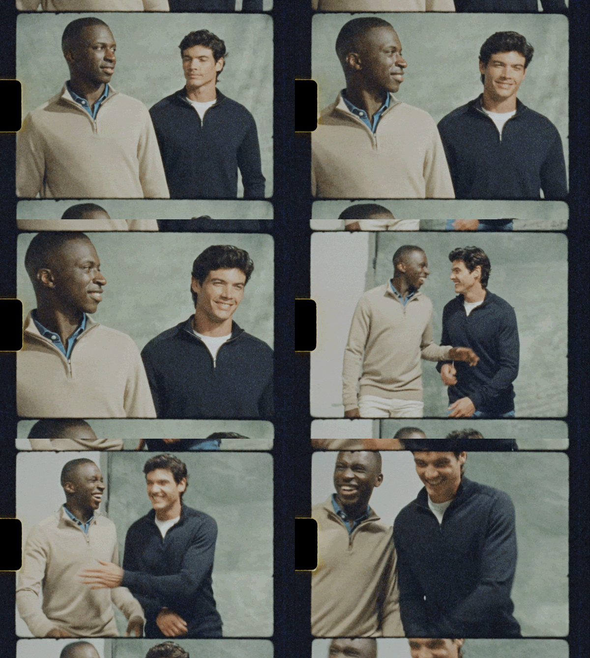
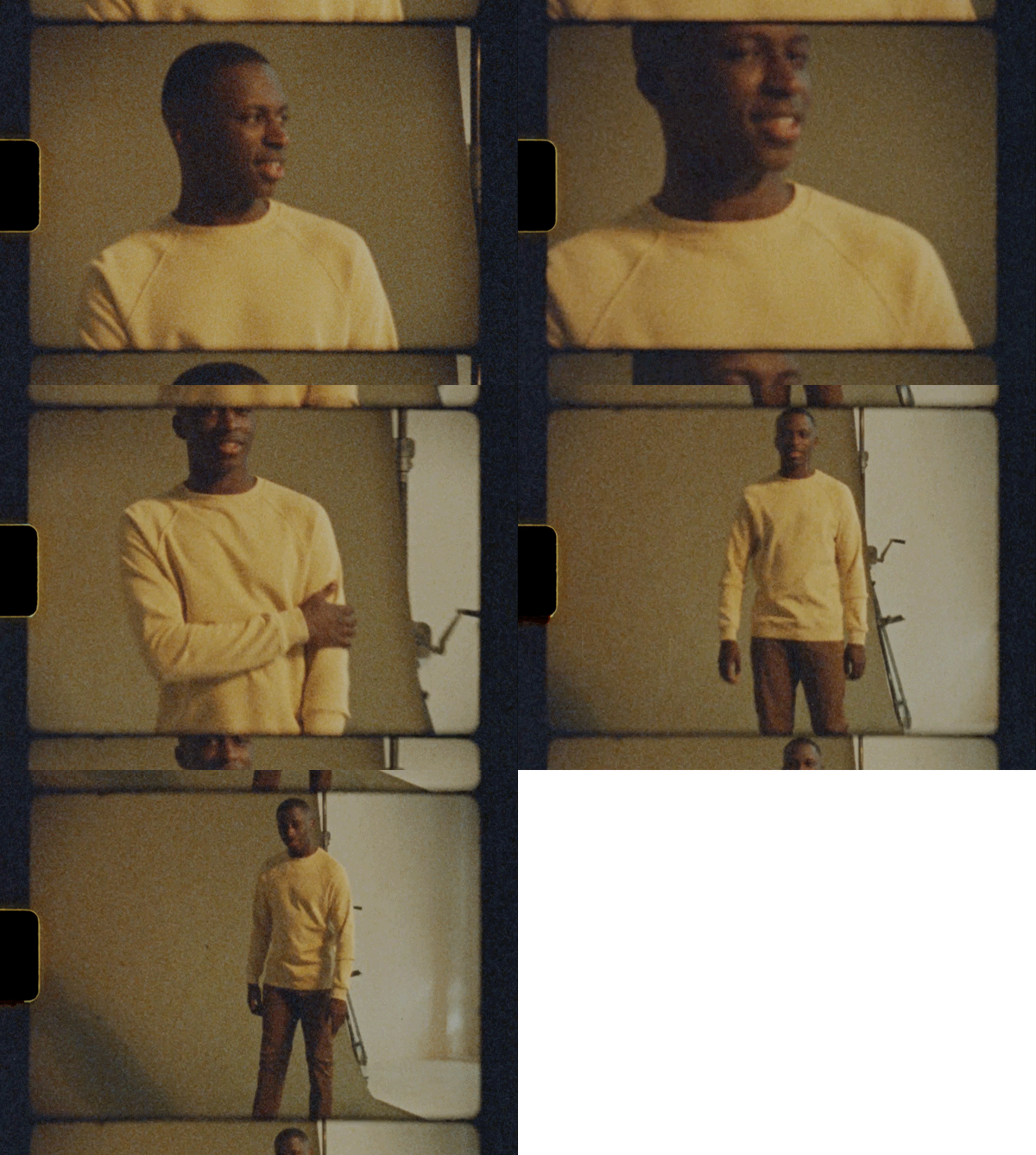
Art Direction by me for in-studio e-com photoshoot with Renze Bemelmans, video by Tim & Stef Bomers, Super8 video + editing by me. Models are Xavier & Adam. Used as BAU/daily business assets.
Fanfaretti Magazine #1
Art Direction, Layout, Publishing
2024 - ongoing
Fanfaretti Magazine is my new, print-only magazine!
Fanfaretti is a timeless magazine about all things creative. It highlights craftsmanship, aesthetics and a positive outlook on life. It is grounded in printed matter, with an interest in lifelong explorations of everything beautiful. The first issue highlights artists, designers, and crafts(wo)men who work and live in Amsterdam, alongside a variety of European photographers and writers who address the theme of localism in their own context.
Editor: Laura Josephine O'Brien
Cover Image: Beatrice Olimpia Bonato
Custom font "Fanfaretti" inside by Jolana Sýkorová of JS Type.
Available in Athenauem (NL), MagCulture (UK), PaperCut (SWE) and Maison Flore (FR).
Listen to the Monocle "The Stack" Podcast where I speak about the idea, process and design behind it.
Featured in FontsInUse.
MR MARVIS Father's Day Campaign
Art Direction + Video Editing
2024
I created the concept, supervised the photoshoot and did the final touches of the stop motion. The concept behind is to suggest different stylings for different types of dads. Instead of using models, I used the more playful style of stop motion.
Photography: Kyle Elaine
Styling: Ildiko Korzelius
Production: Margherita Sanzesi @MrMarvis
Sicels
Branding, Campaign
2019, 2022
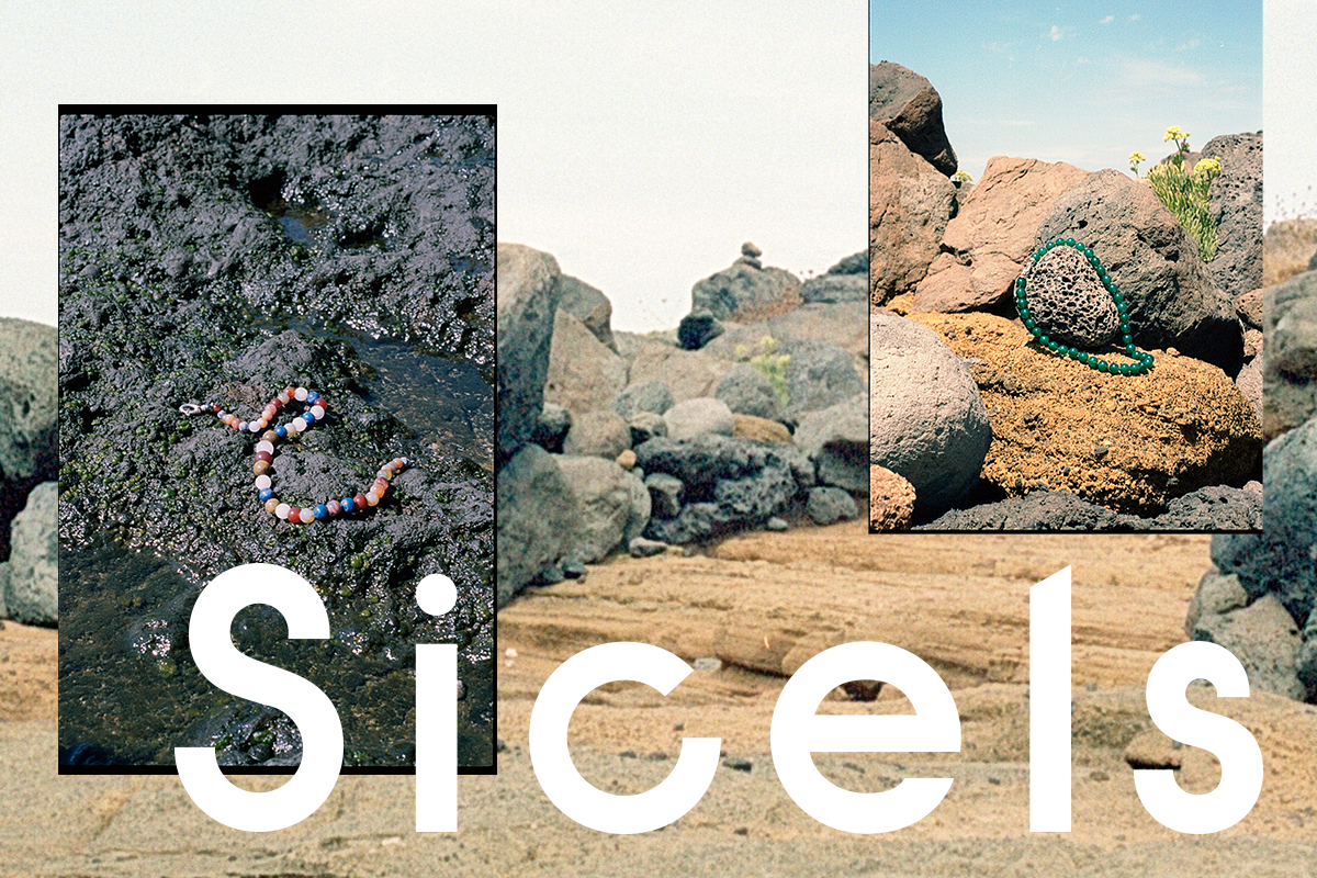
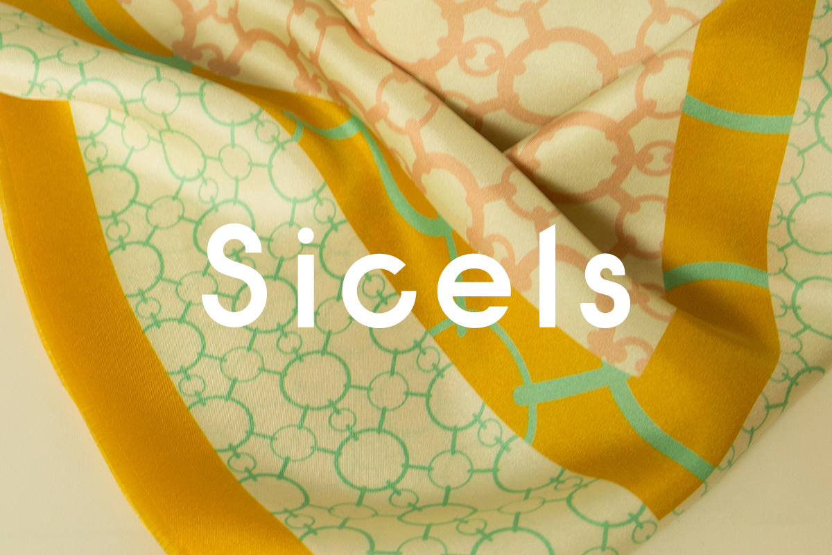
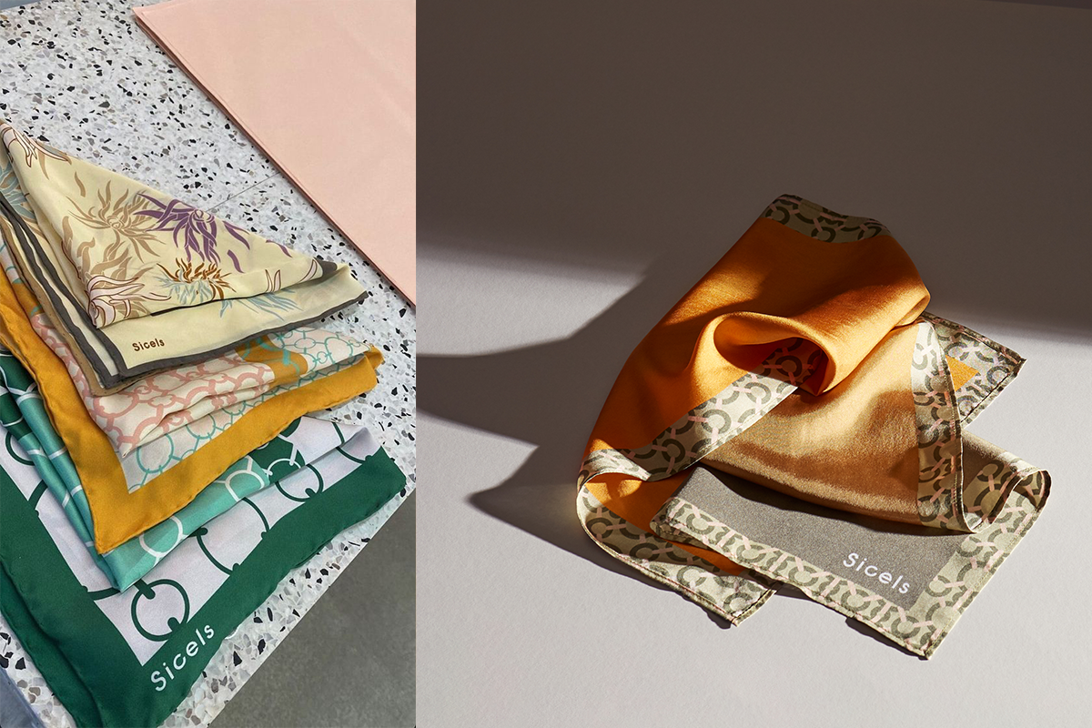
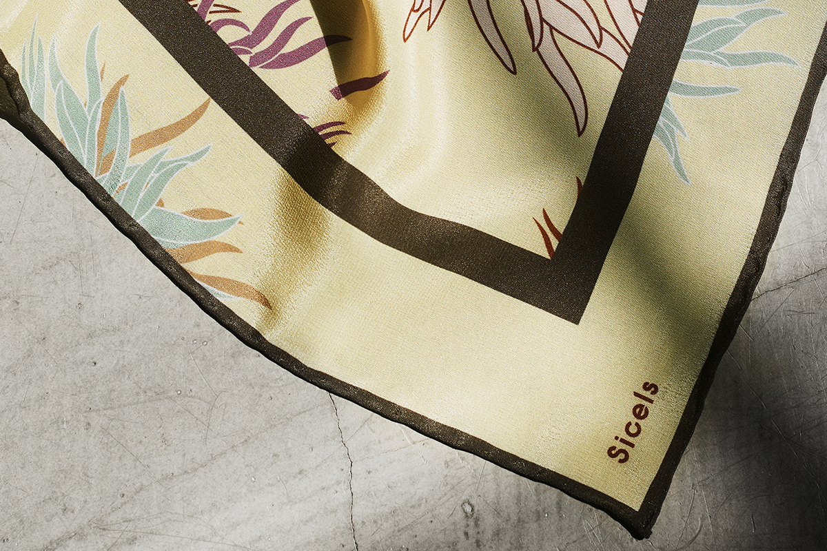
The Sicilian/Danish brand of sustainable silk scarves and jewelry run by Mariapia Mineo, asked me to come up with an identity for her products. The identity is embedded in Scandinavian aesthetics, while having a bit of a Mediterranean quirk. The campaign imagery for the new jewelry line was shot by me on Ustica in 2022.
The Os Agency
Branding
2023
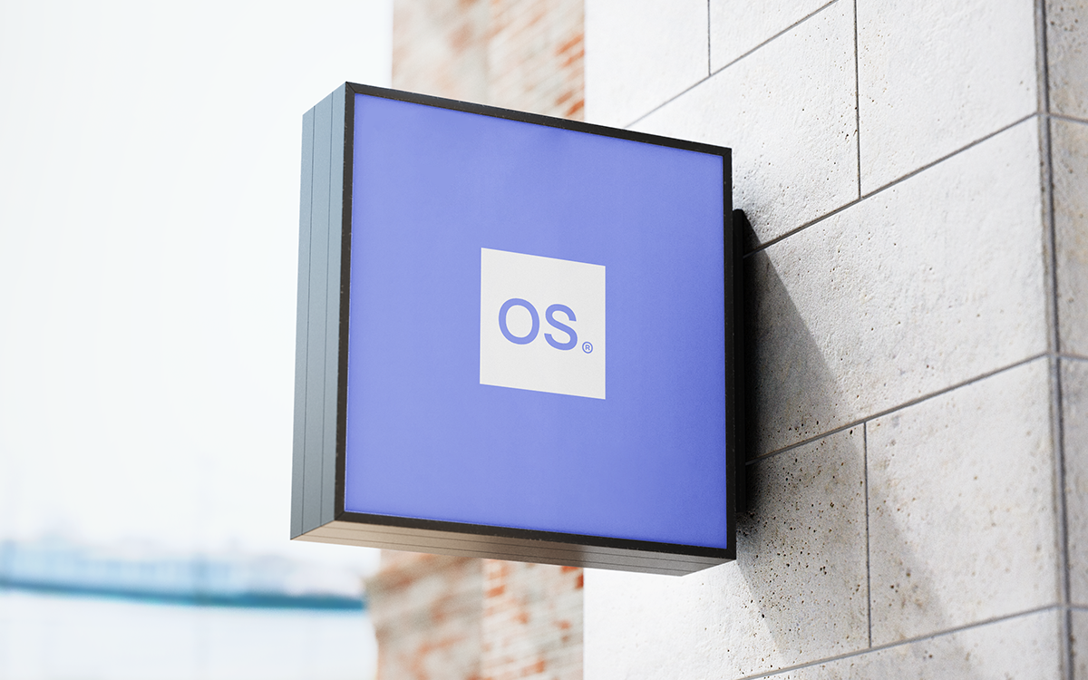
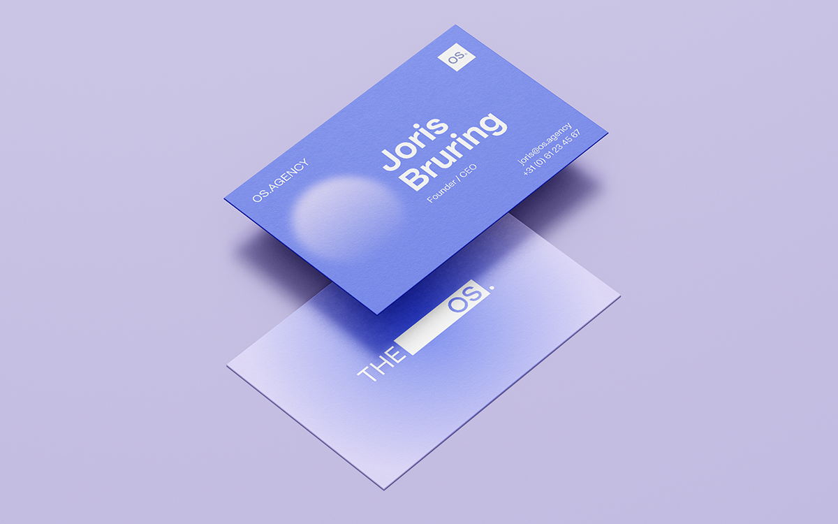
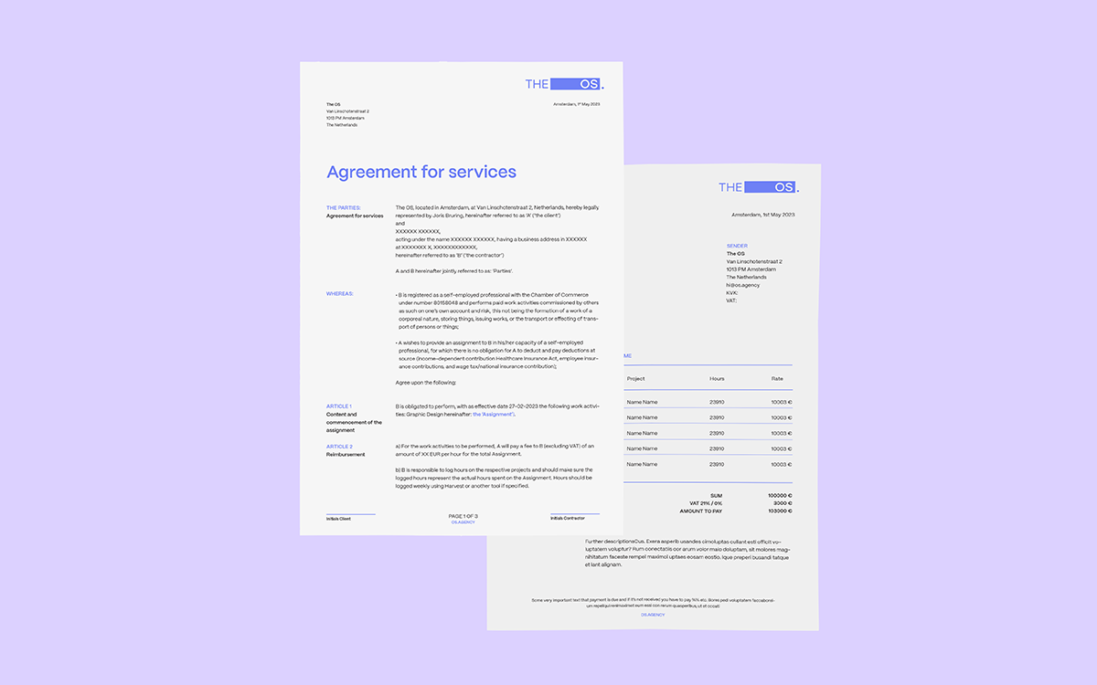
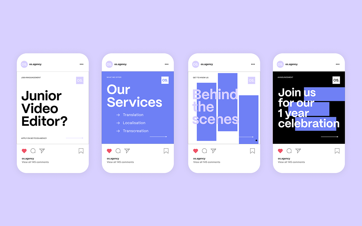
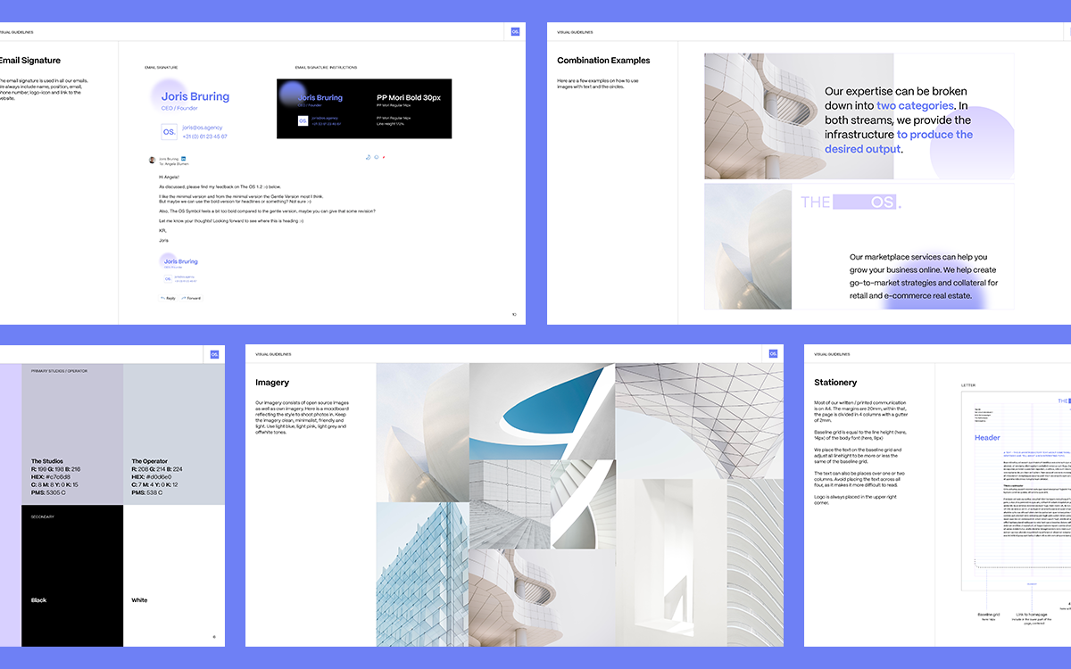
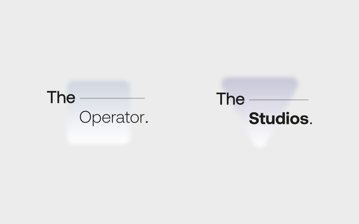
The OS.Agency asked me to renew and expand on their identity. The original logo had to stay the same, but everything else, along with the logo-mark, were created by me. The sub-divisions of the OS: The Studios and The Operator also received their own logo and branding. Besides the art direction, I also templated all the assets for their further use.
Detail.nl
Branding, Art Direction, Web Design
2023
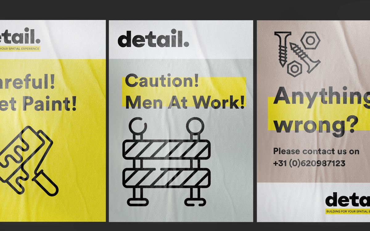
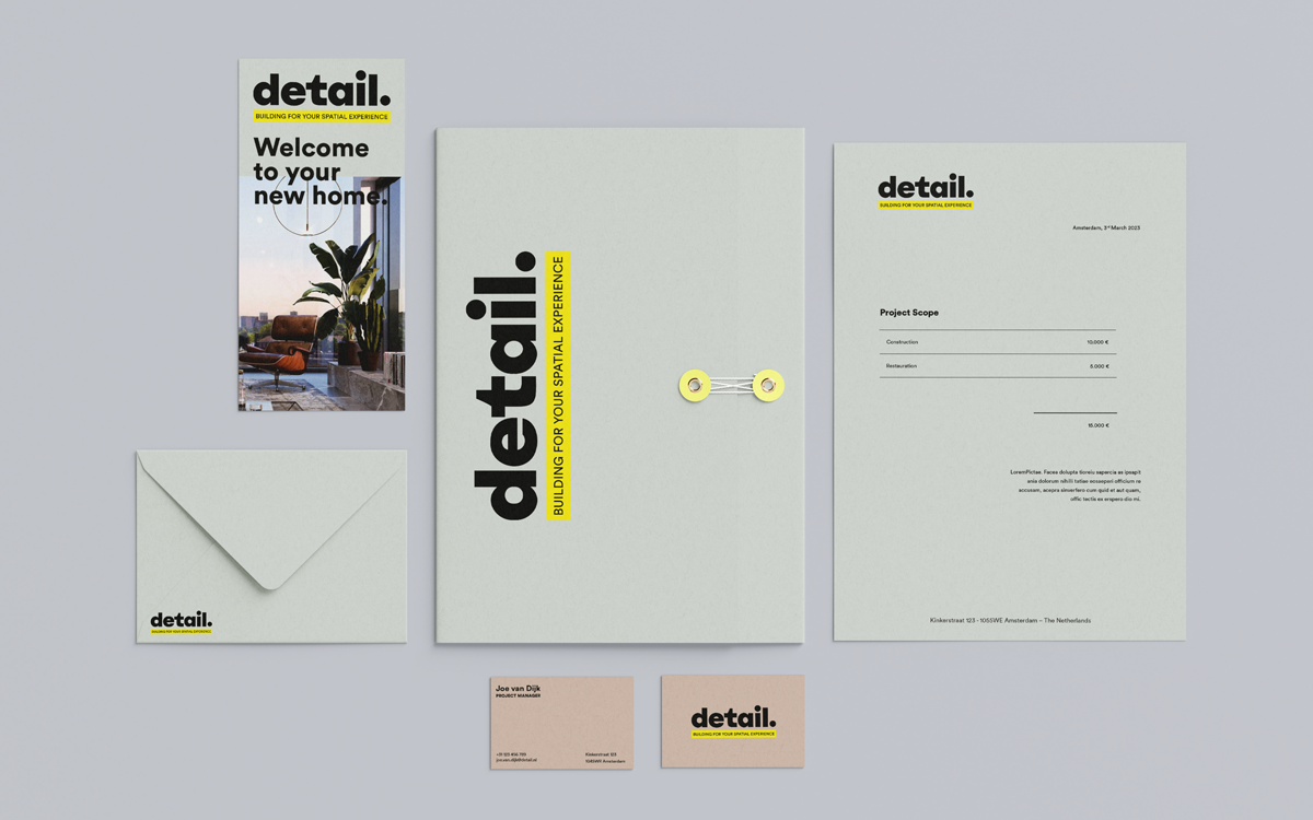
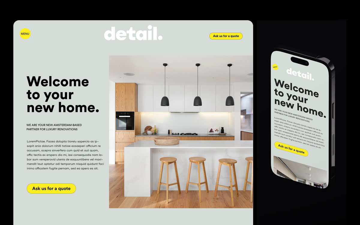
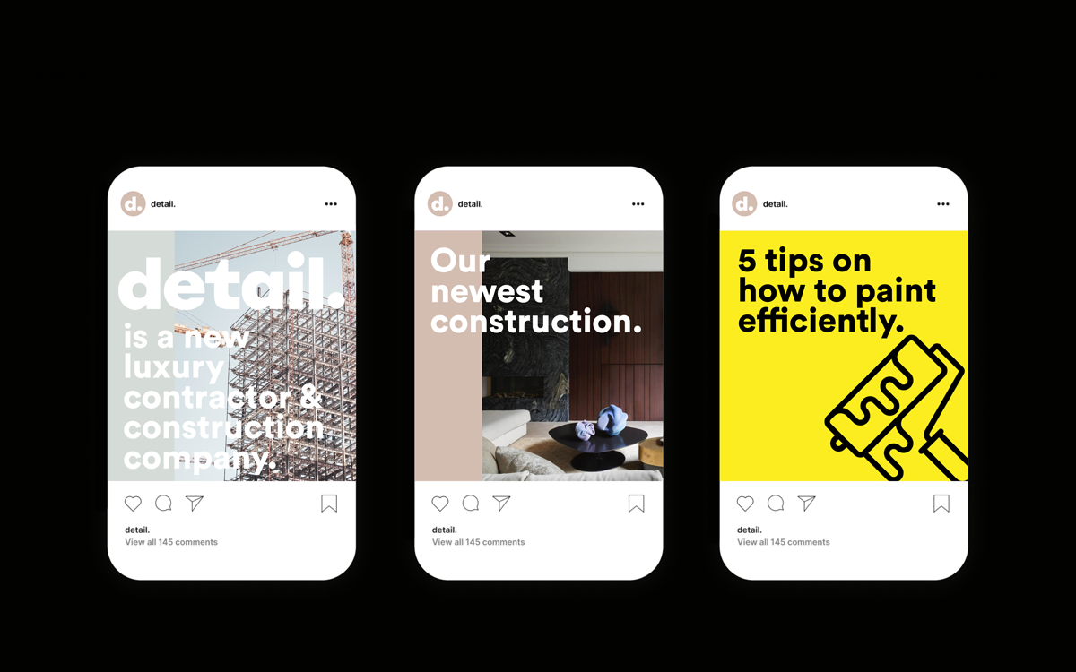
Detail is a new Amsterdam luxury construction company. It communicates a modern, clean and appealing style while still referring to the construction site. The brand is currently being executed in all assets.
Ambivalence Magazine
Art direction, Branding, Publishing, Curation
2019 - 2021
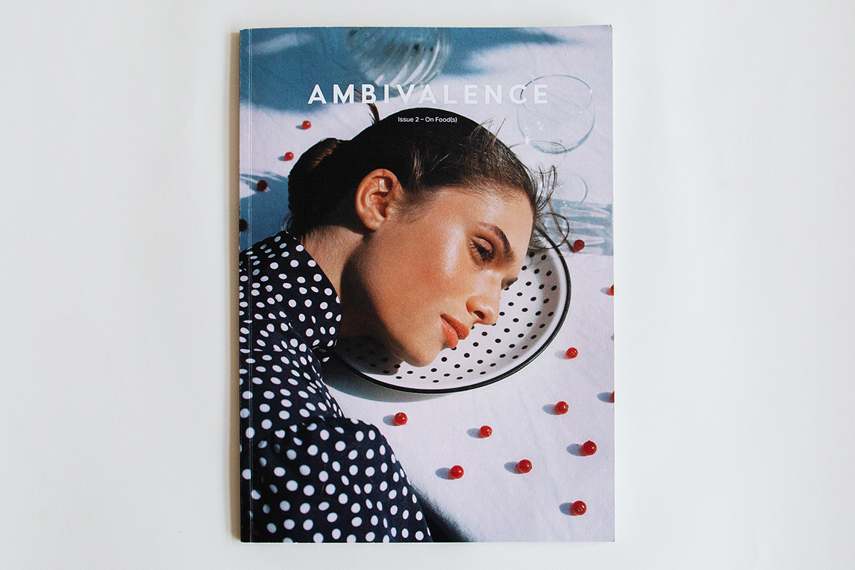
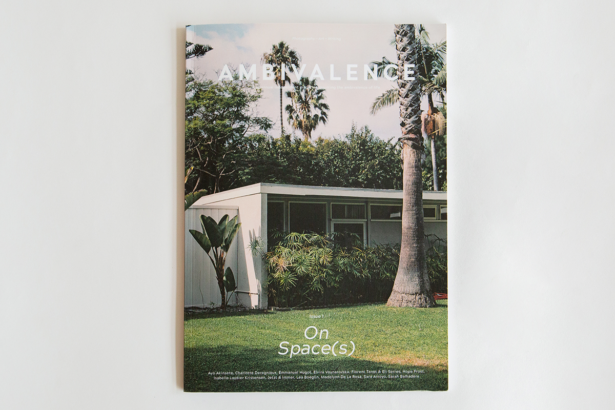
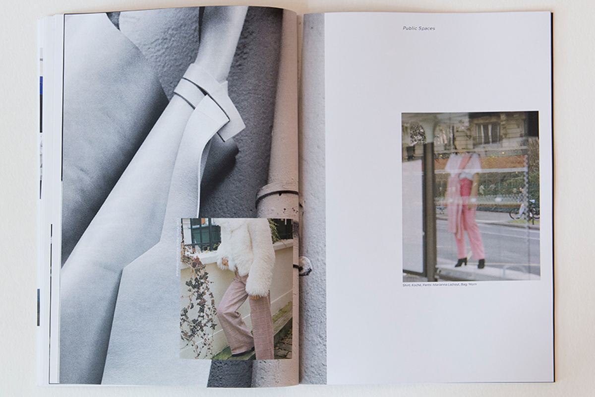
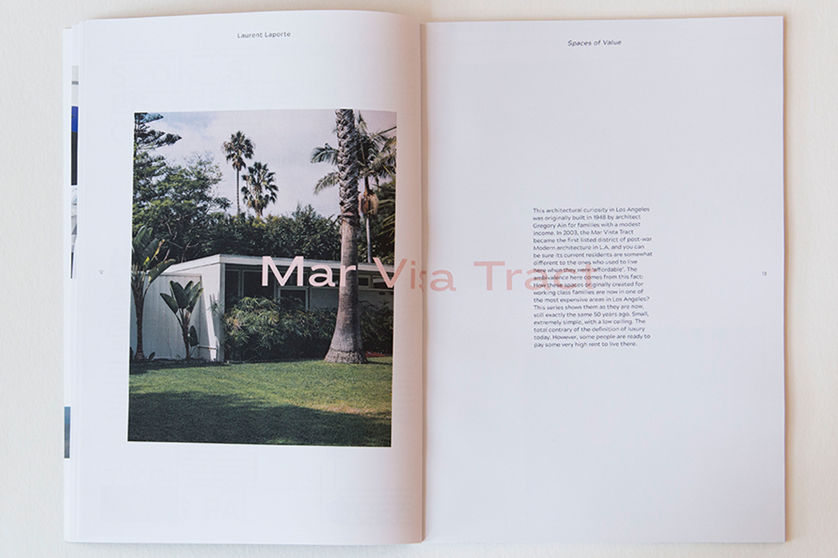
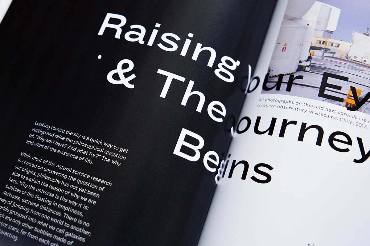
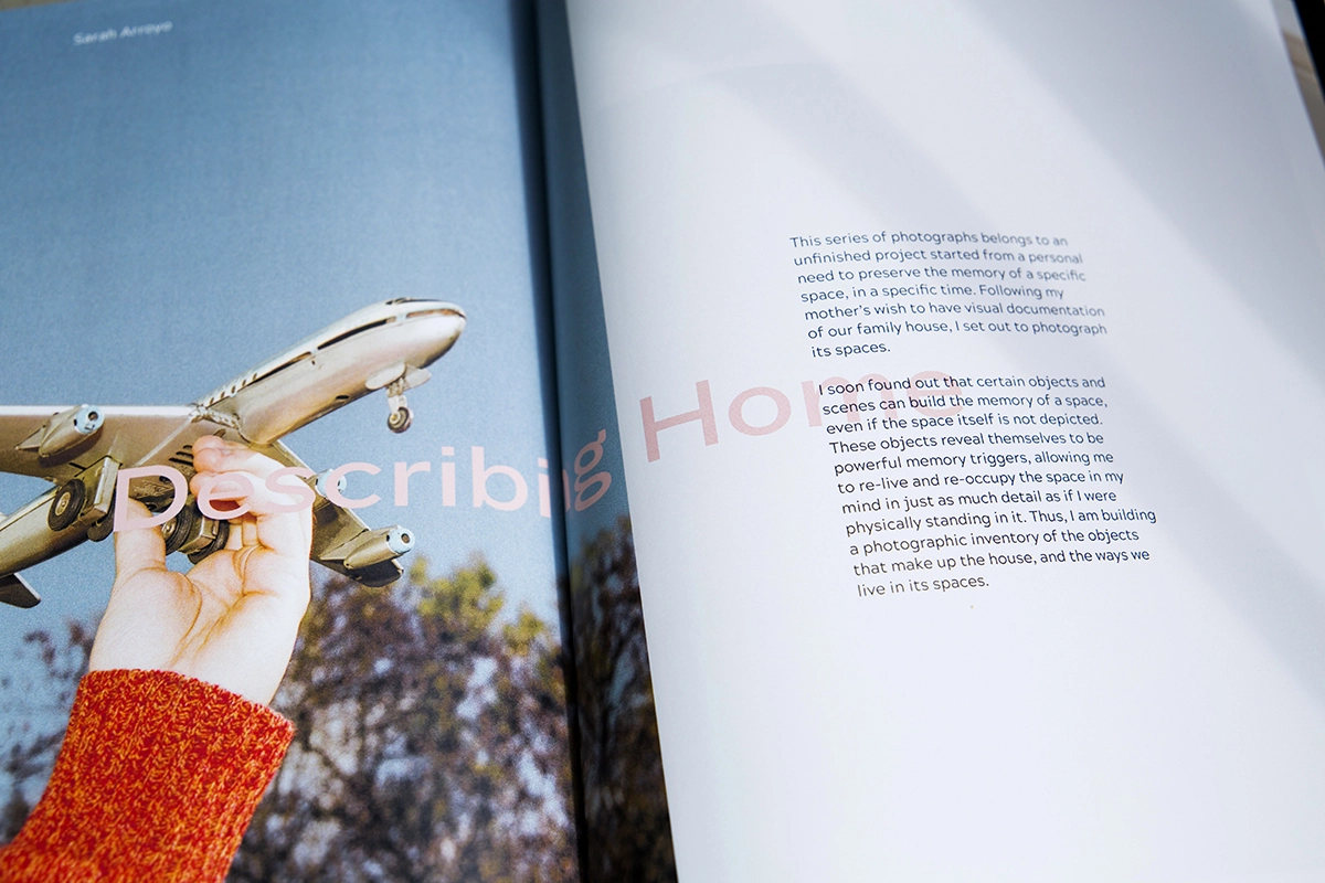
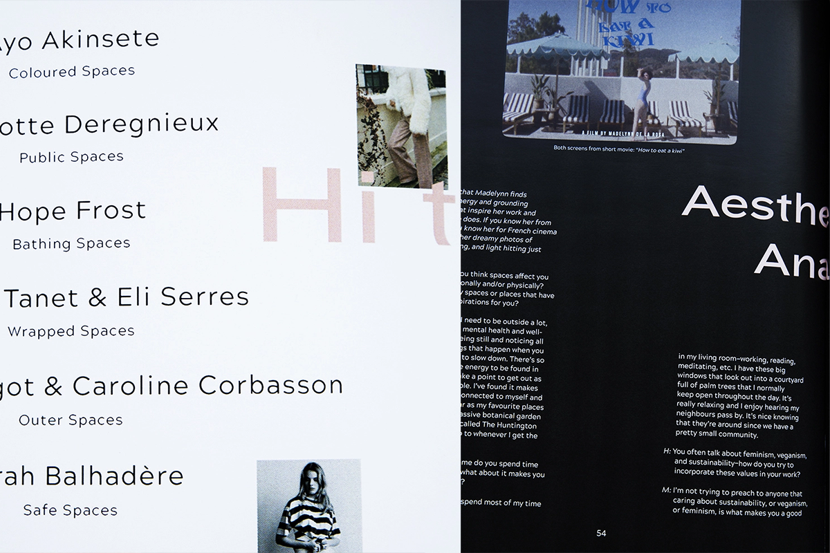
Ambivalence magazine is an exclusive content, independent magazine published in two issues: On Spaces and On Food. I have asked a variety of artists to interpret the theme and moodboards in their own medium of choice, and to create editorials, written pieces and art for the publication. The first issue can be found on FontsInUse.
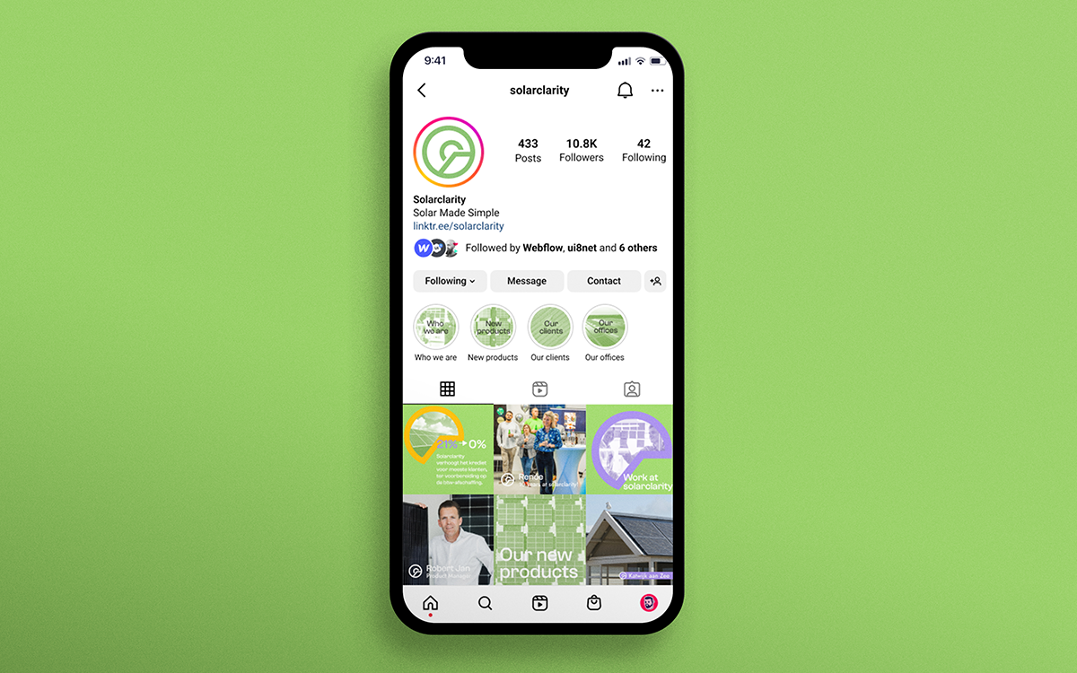
Solarclarity
Branding, Art Direction
2023
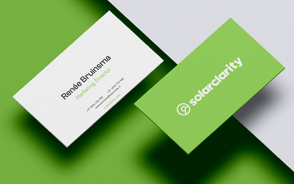
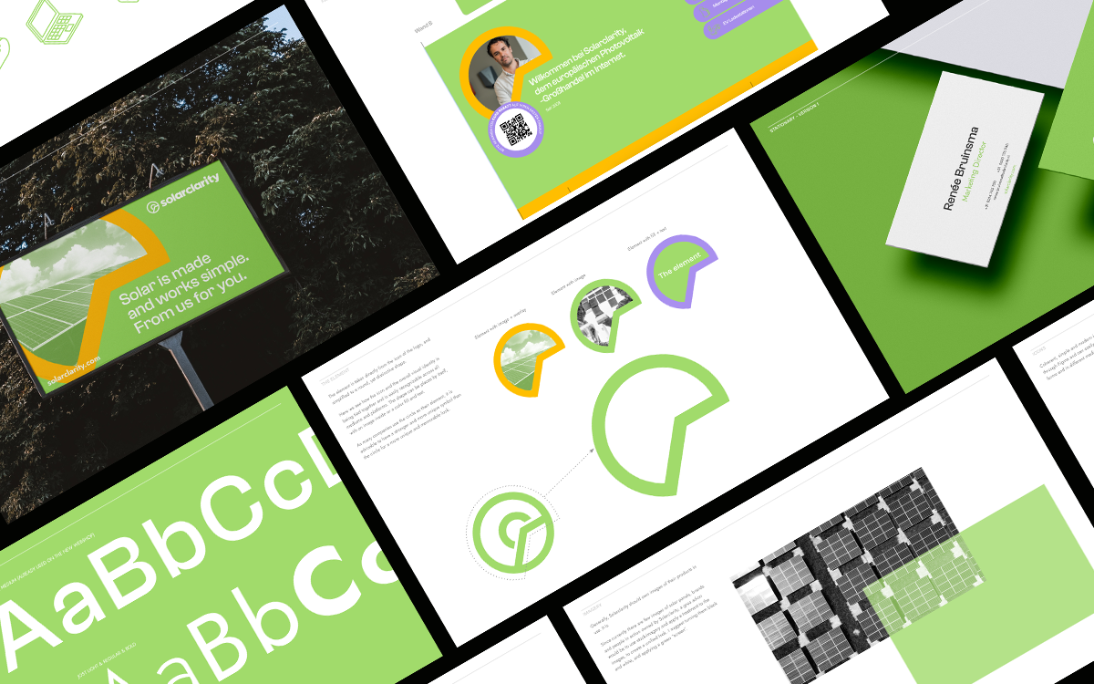
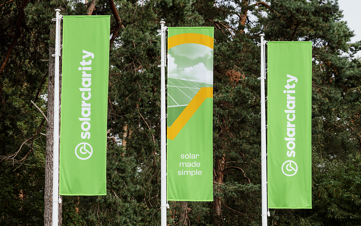
Solarclarity asked me to work with them on a proposition for the board of a rebrand for the company. They are a solar distributor (B2B) and wanted to elevate their brand with a new logo, images, icons, colors and fonts. It should be friendly, technological, approachable and communicate sustainability.
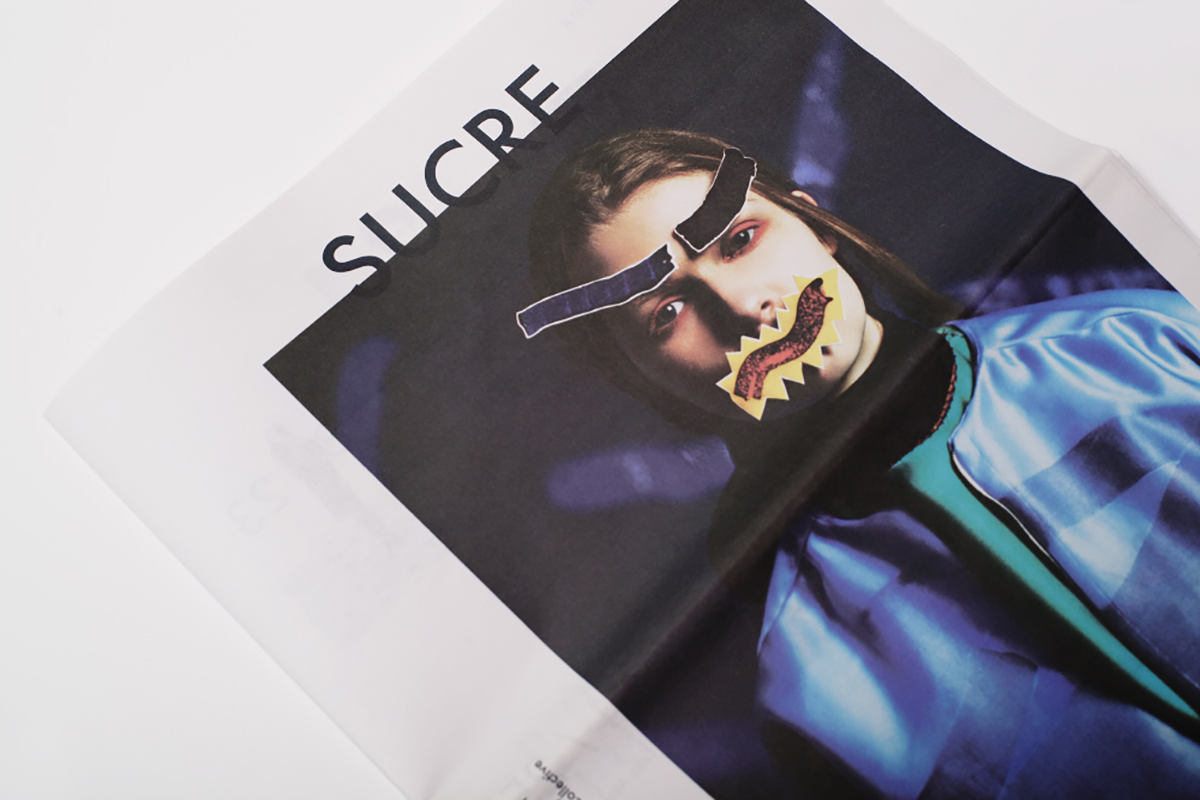
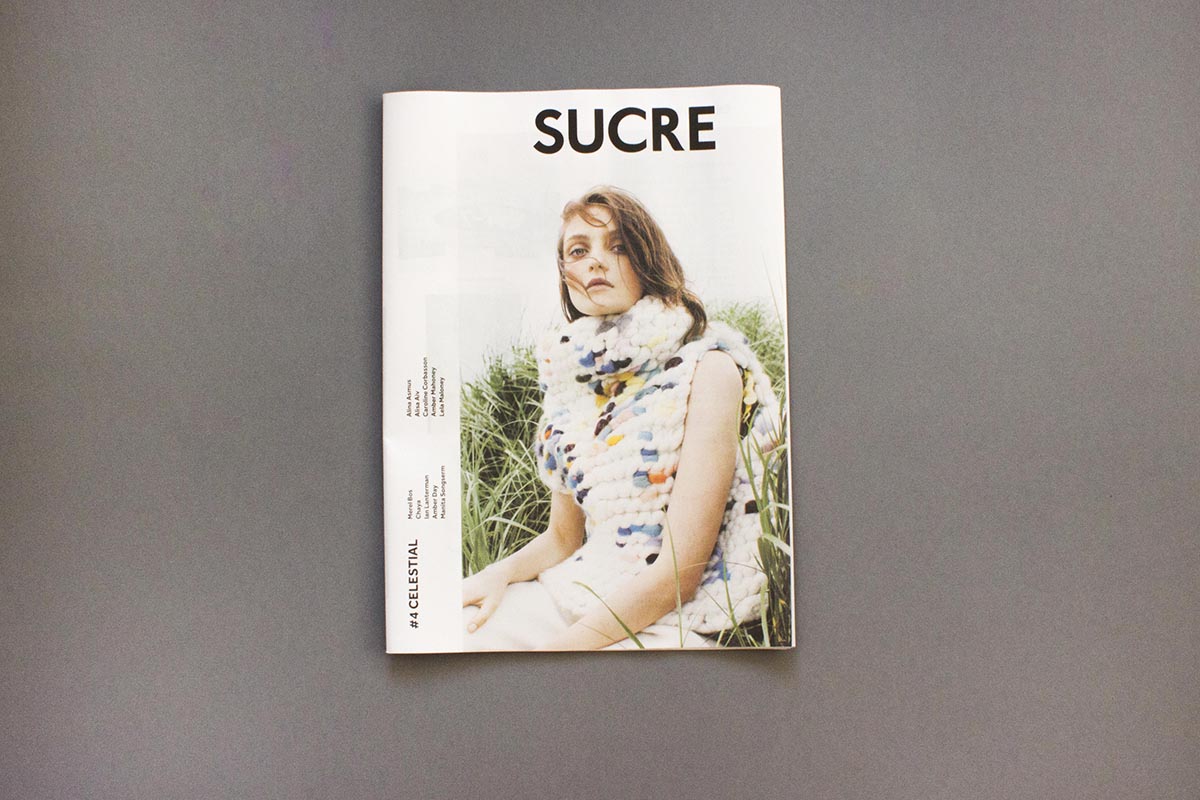
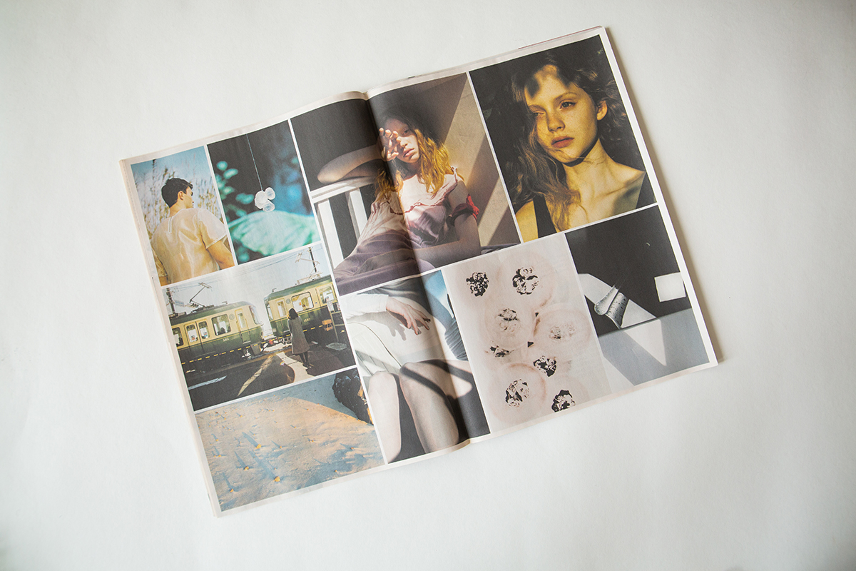
Sucre Paper
Art direction, Branding, Publishing, Curation
2013 - 2019
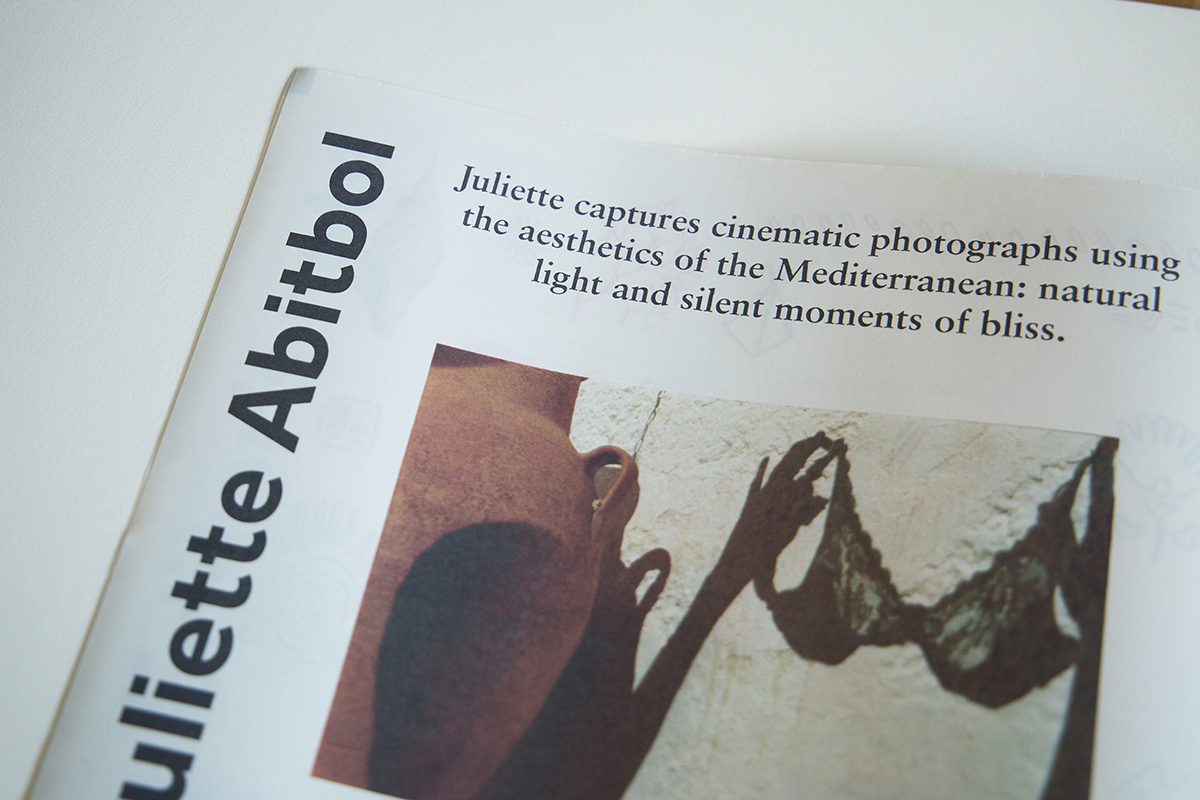
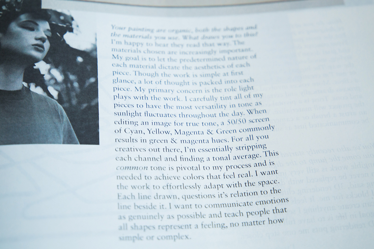
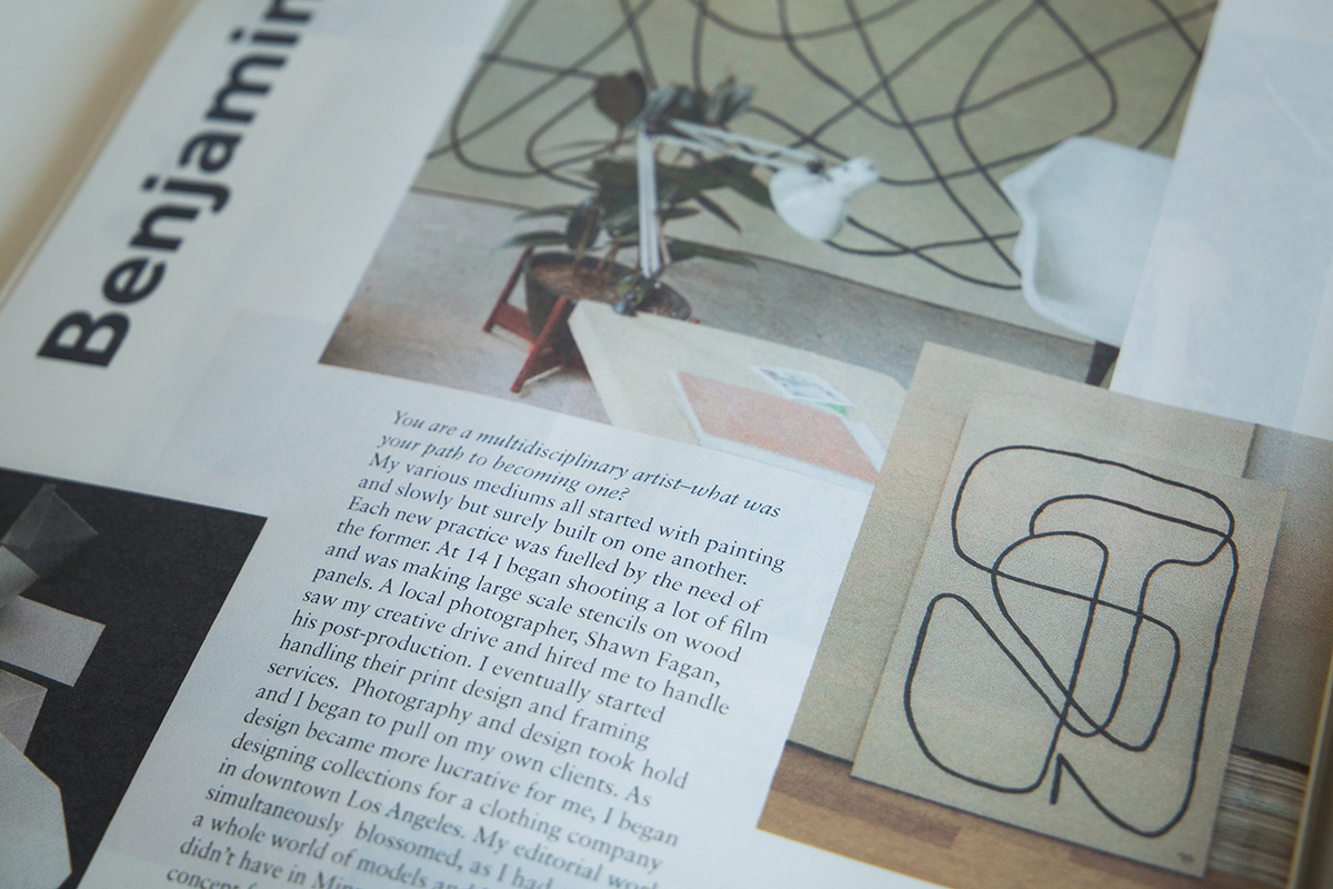
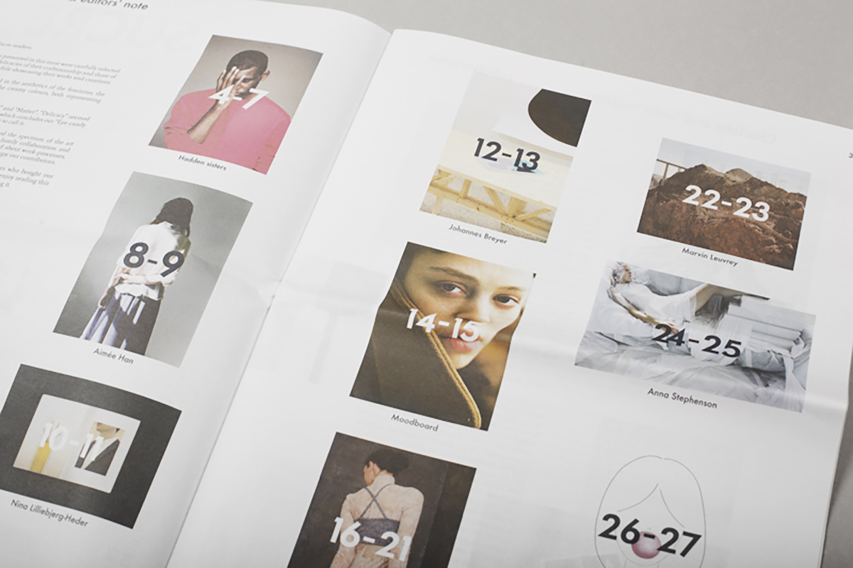
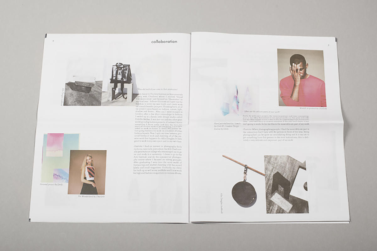
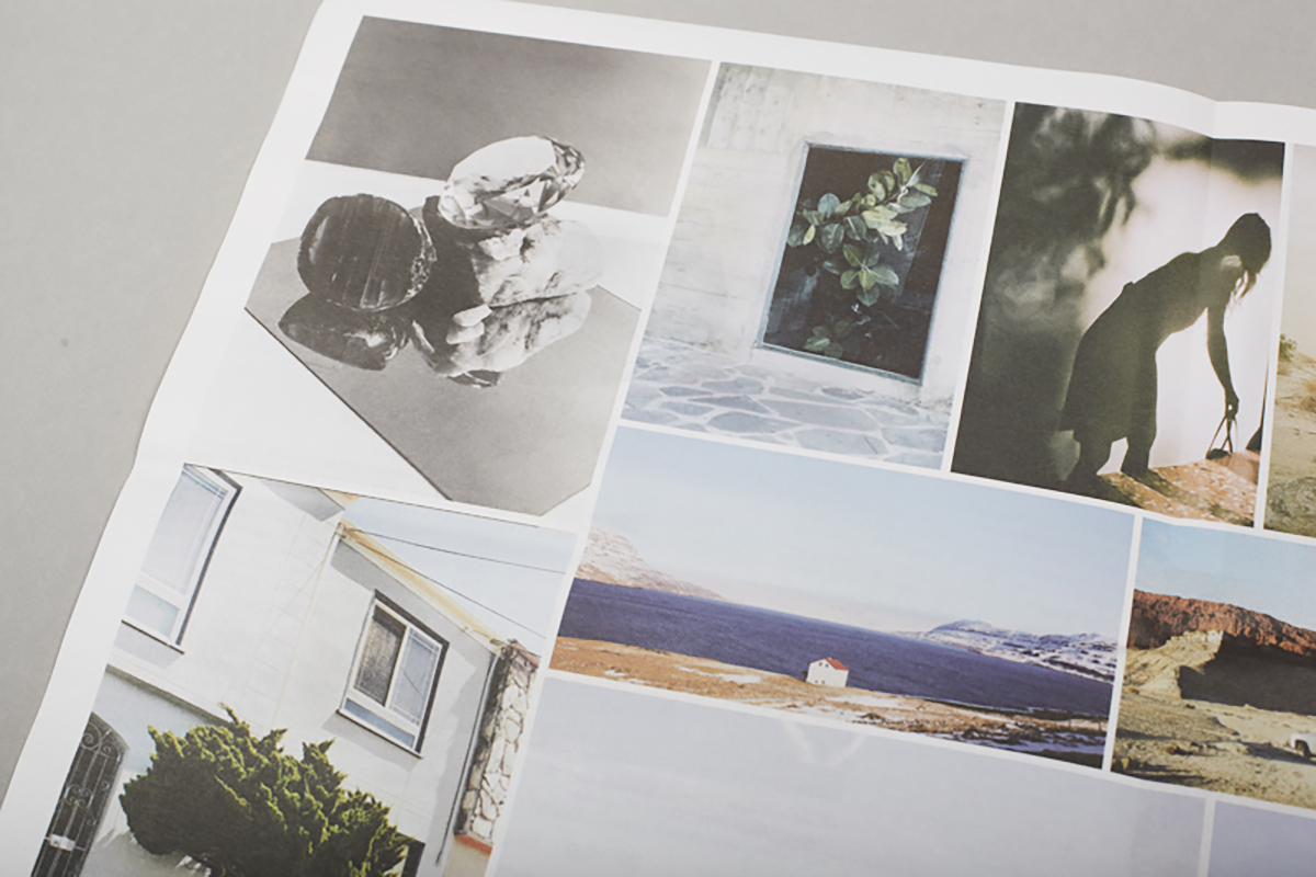
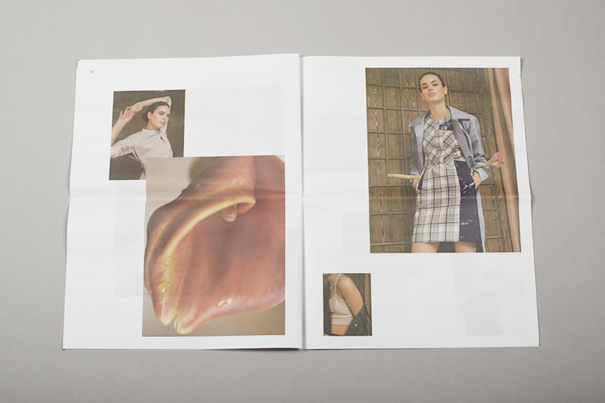
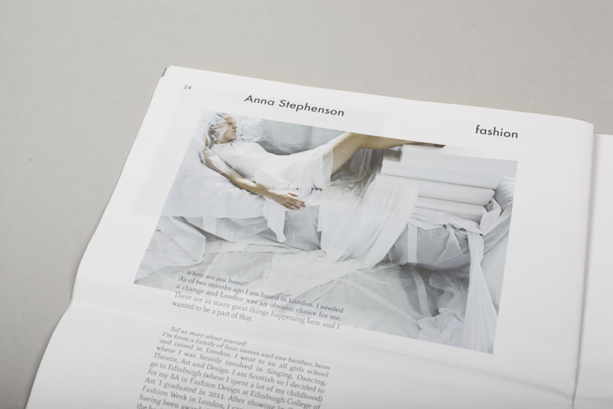
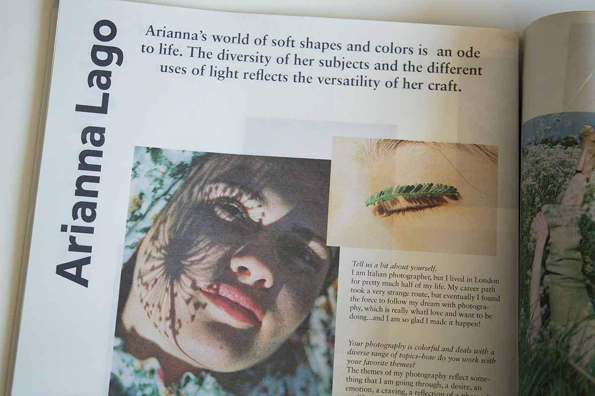
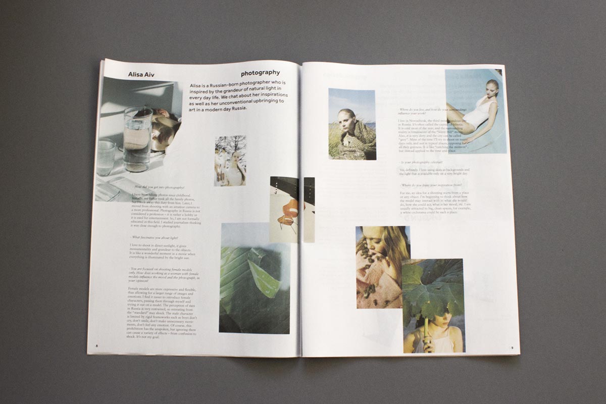
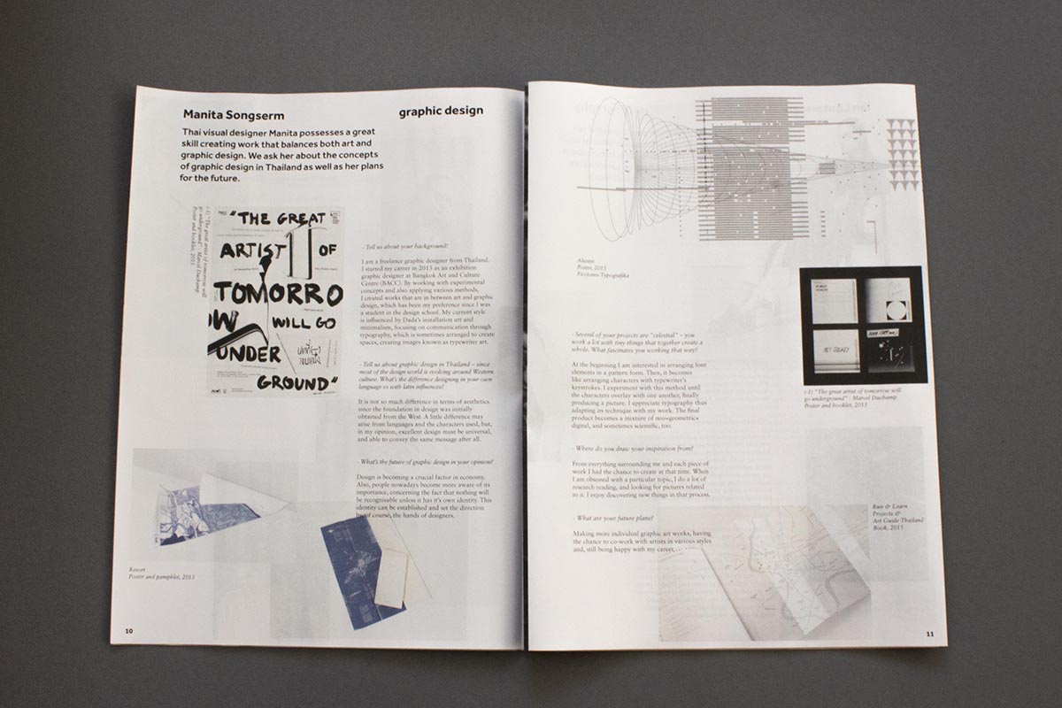
My first ever design and publishing project, started in 2013 and continued thru 2019. I curated a variety of up-and-coming artists from different fields into a newspaper-style, print only magazine. There were 5 different issues published: Soft Tones, Matter, Delicacy, Celestial and Anthropology. The layout is inspired by the design grid of a popular tumblr theme back then. Since all of the artists were sourced through tumblr, it felt like the right fit to extend the digital layout into print. The logo and fonts used are simple and modern, to not draw away attention from the main focus -- the images -- of the magazine. If you want to have a look at the physical paper, don't hesitate to contact me.
Jajamän – cork backpacks
Art Direction, Branding
2019
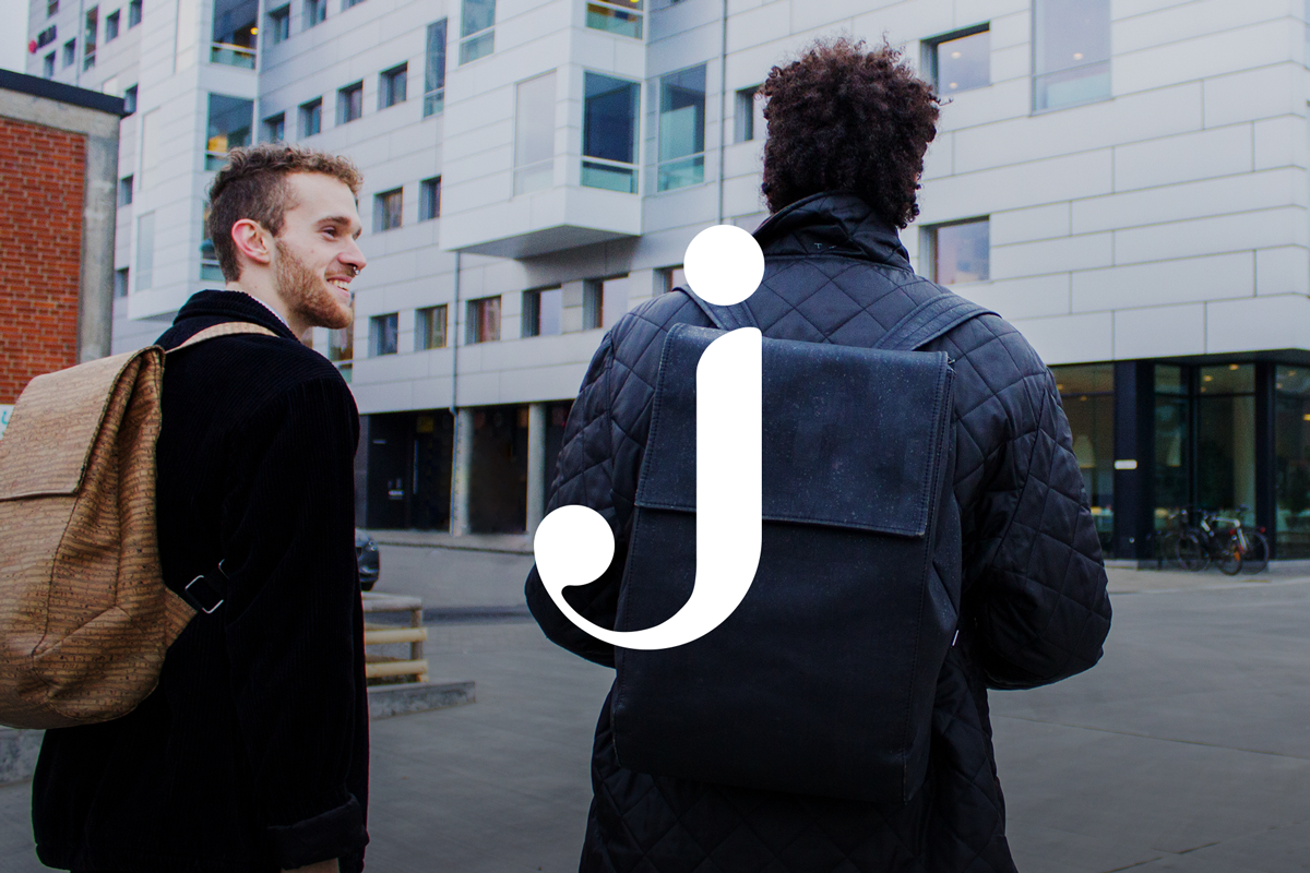
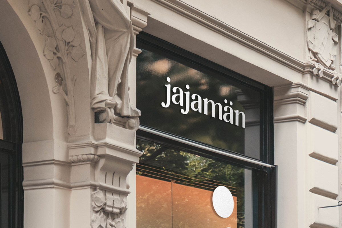
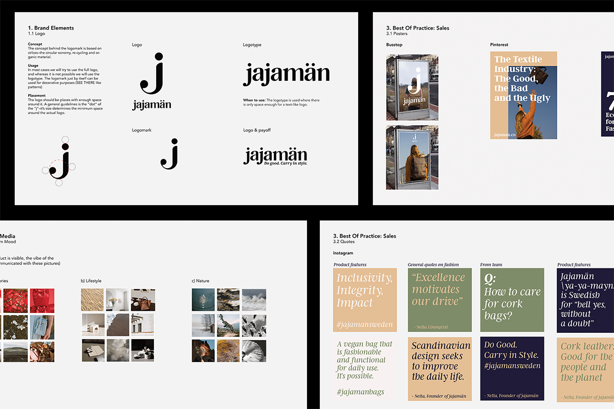
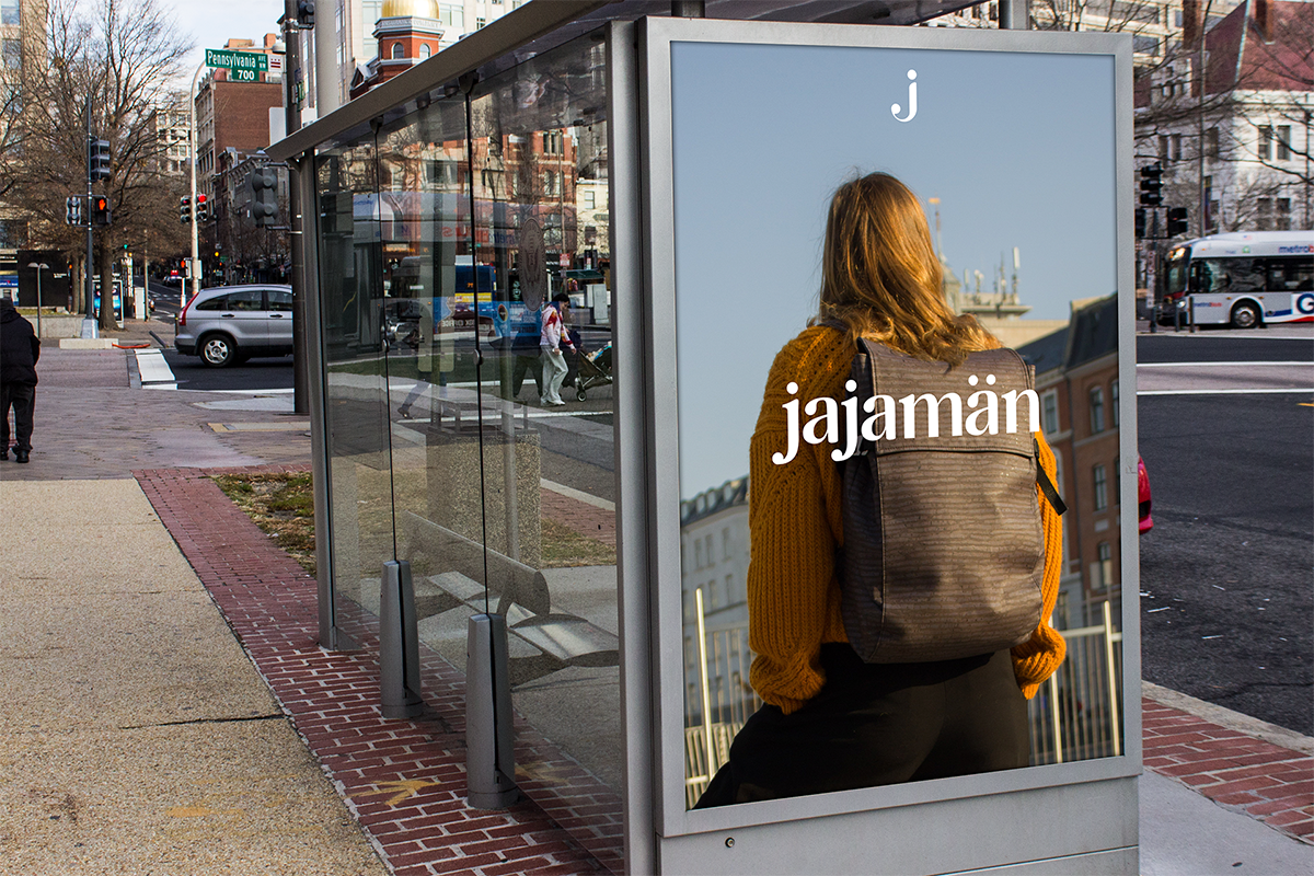
Jajamän, a sustainable cork-leather backpack hired me to do everything from setting the tone of the brand, to designing the visual guidelines and producing visual content, both graphic and photography, for social media. The J's shape and form is created out of circles, to represent the brand's values of a circular and sustainable new material -- the cork leather. It has been featured on a range of platforms (designboom), (inhabitat), as well as it's been successfully funded on Kickstarter.
Ruslings -- your dumpling brand (WIP)
Art direction, Branding, Packaging
2022
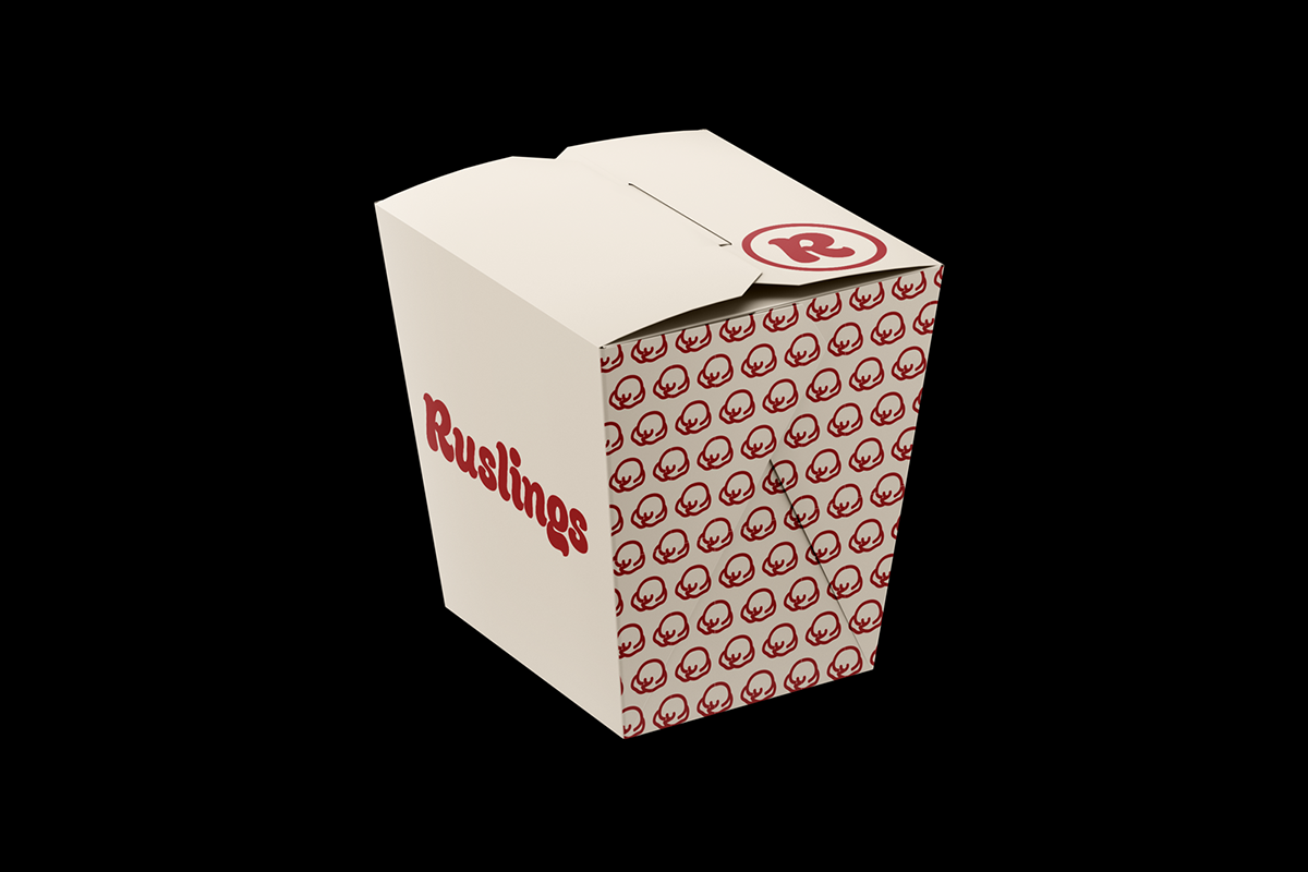
Visual identity for the soon-to-come fast food chain of dumplings opening in Amsterdam. The identity plays on the classical colors of fast-food, and clearly presents the dumpling (shape) being sold. The menu allows you to choose between different fillings, a sauce and a topping. If you want to convince my friend to finally make this brand happen, feel free to reach out to him :).
AJ Sandwiches
Art direction, Branding
2021
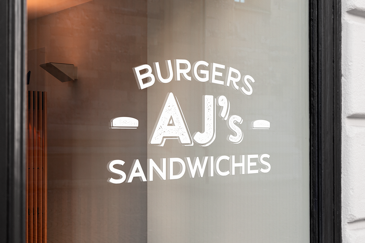
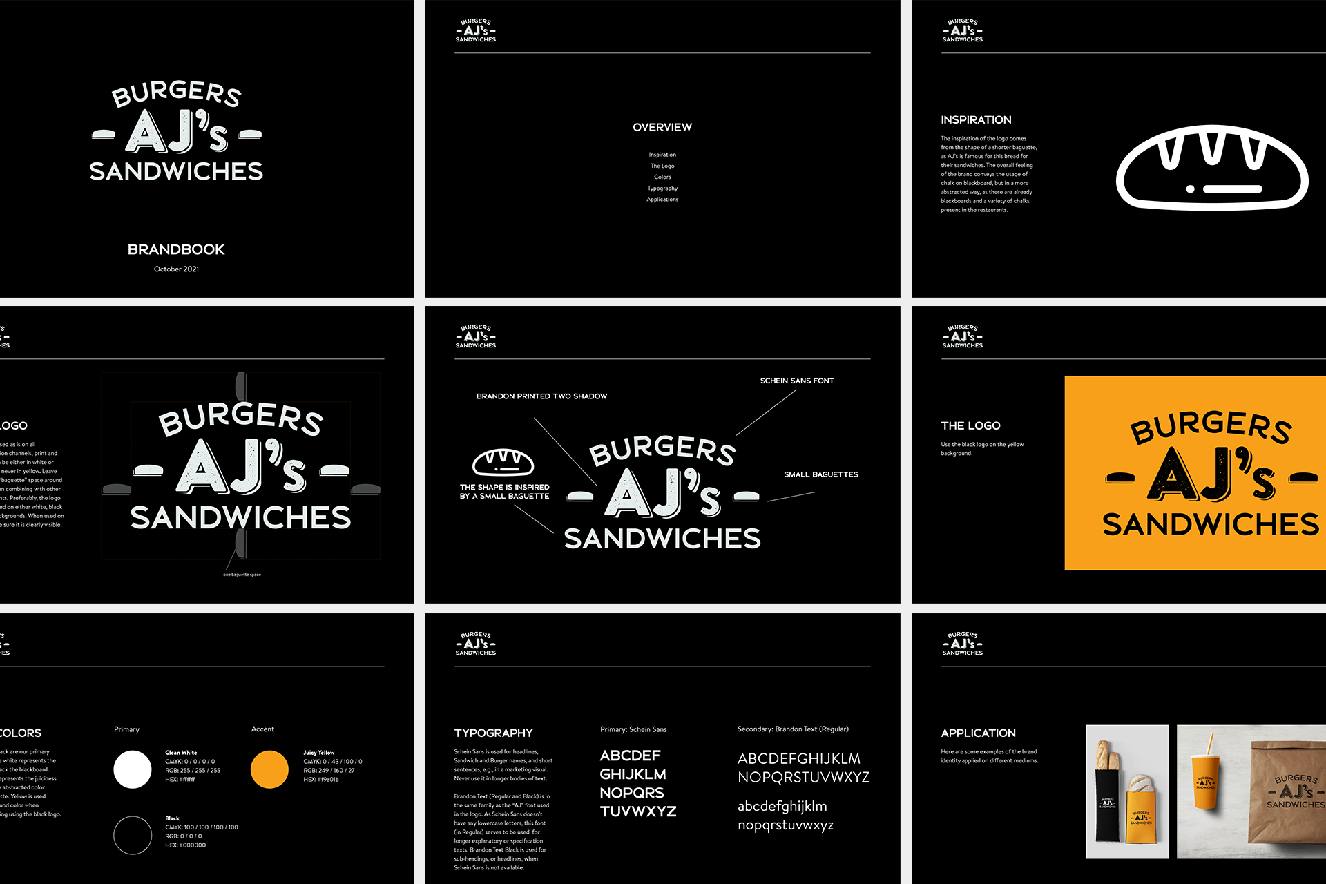
Art direction and a new identity for a sandwich place in California. The concept is based on the "French bread" aka the short baguette, alongside the interior which is covered in blackboard that is free to use for the restaurant's guests.
Sea Together Magazine
Art direction, Branding
2017 - 2019
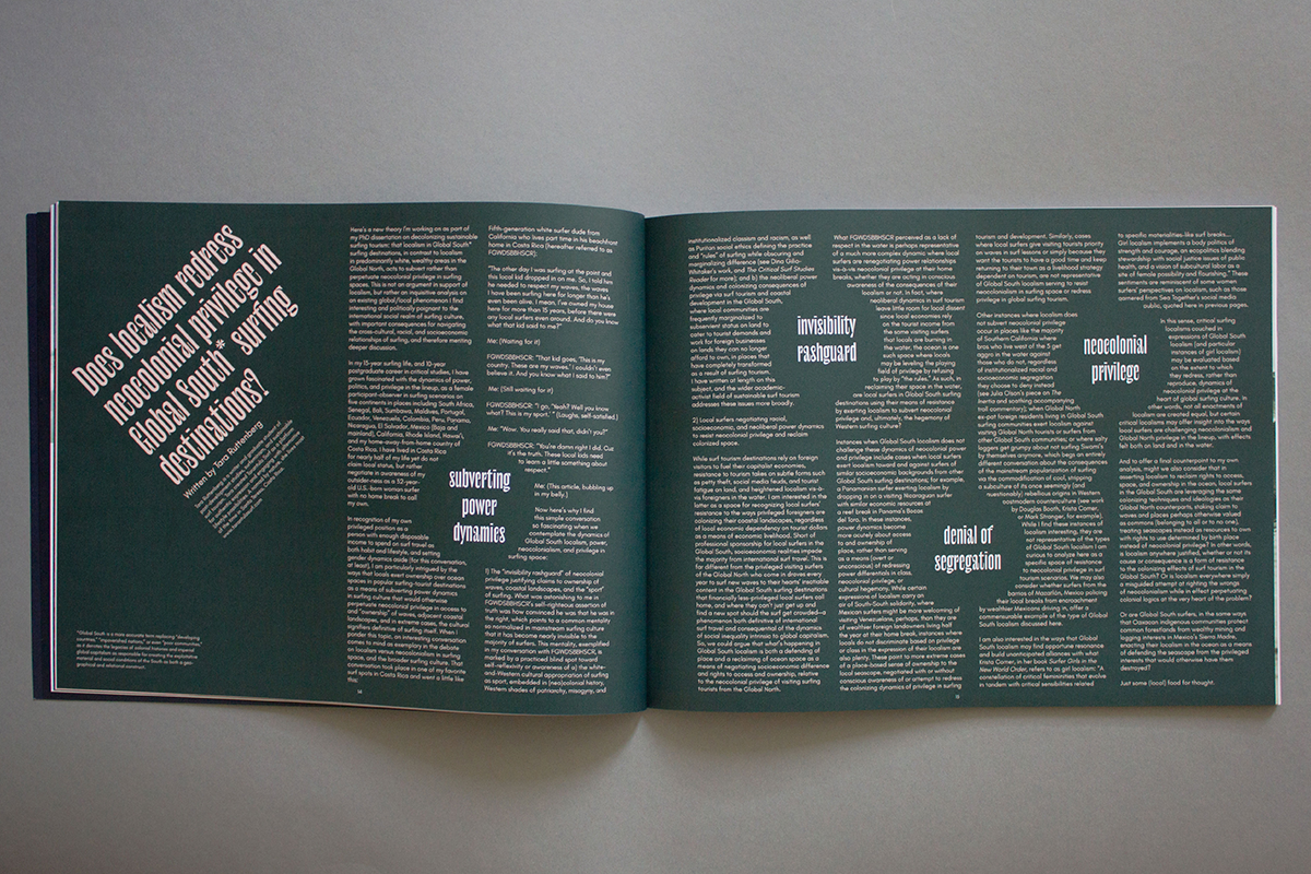
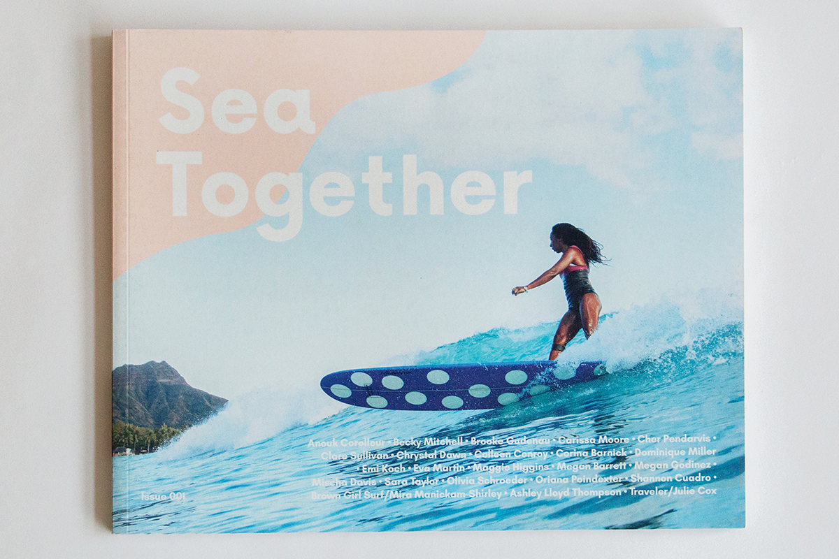
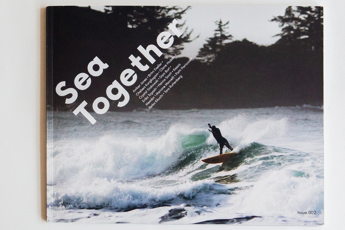
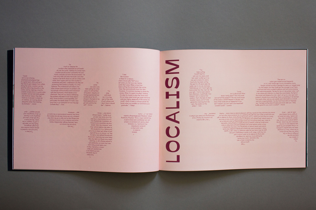
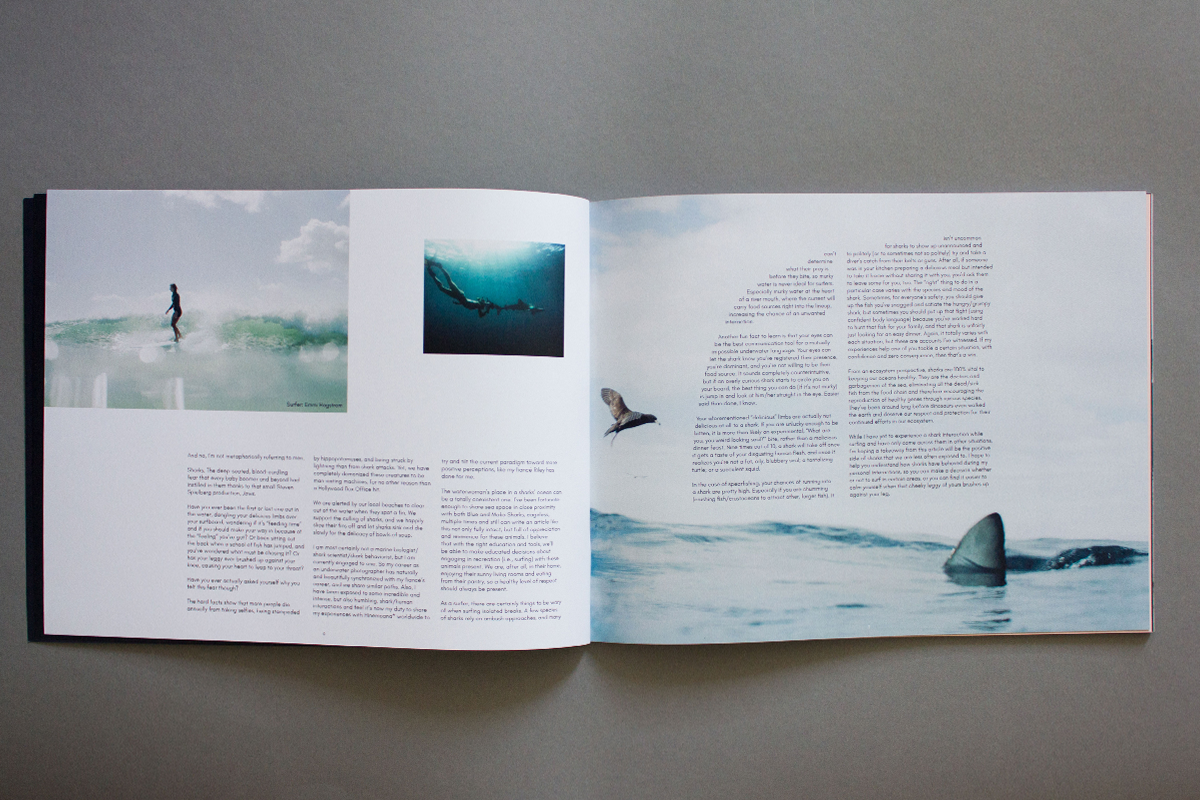
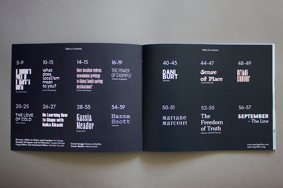
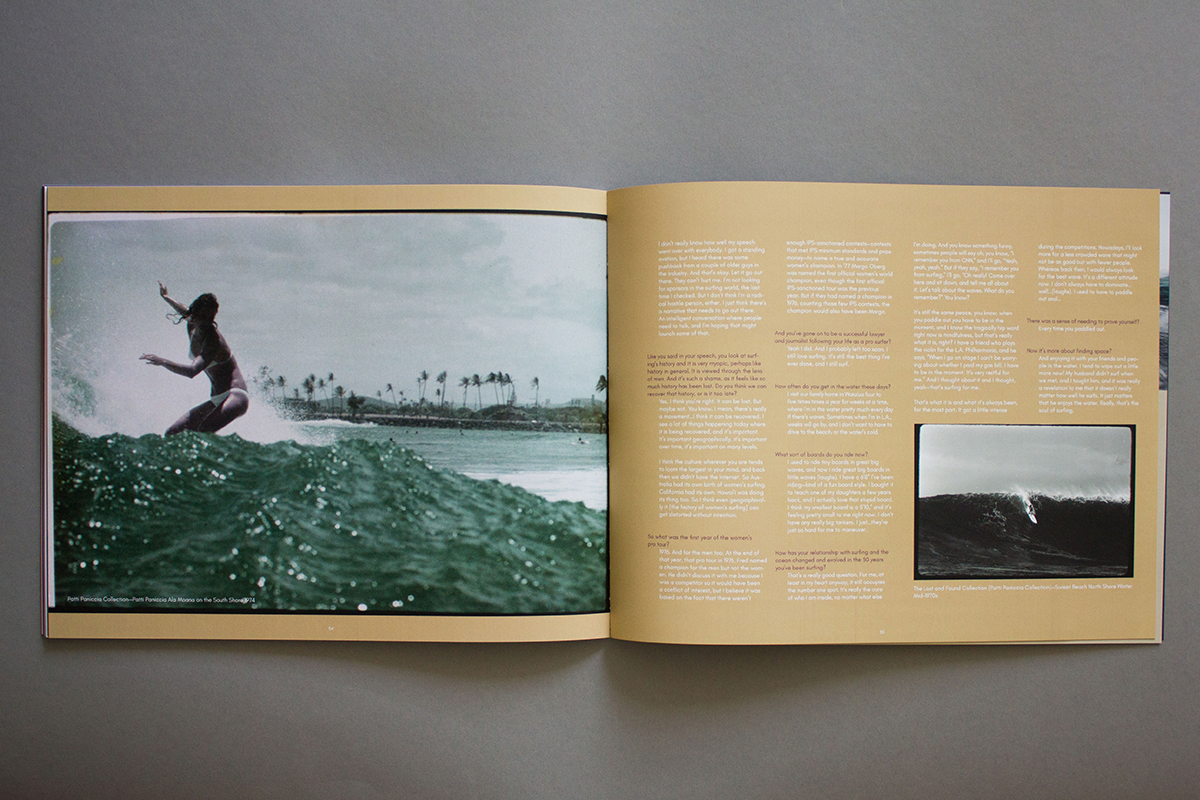
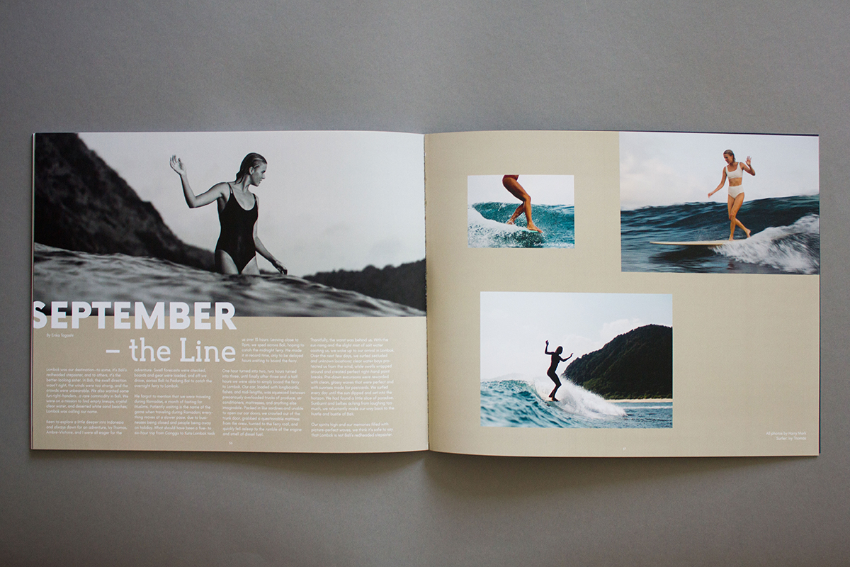
Back in the tumblr days I promised my online friend, Brianna, now the founder of Sea Together, to help her brand and design a magazine if she ever wanted to make one. She really wanted to create a girls-only surf magazine focusing on the diverse aspects of communities around the world. I helped her create the visual identity and the layout of both the First and Second issues, both of which got fully funded on Kickstarter. Each page of the magazine has a unique design to fit the interview or contributor. All of the fonts used are from the open source independent foundry Velvetyne.
Camille Eats
Branding, Art direction
2019
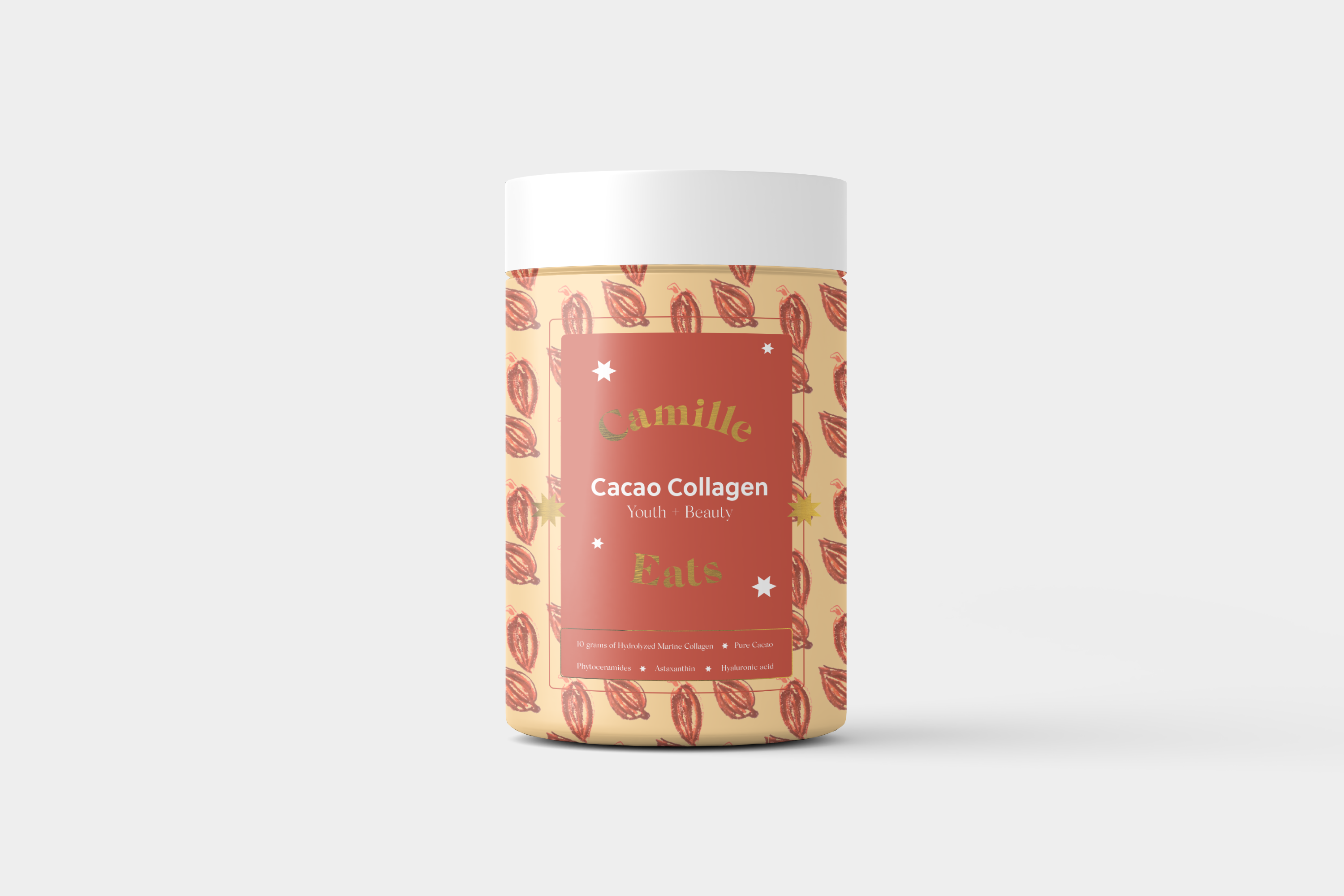
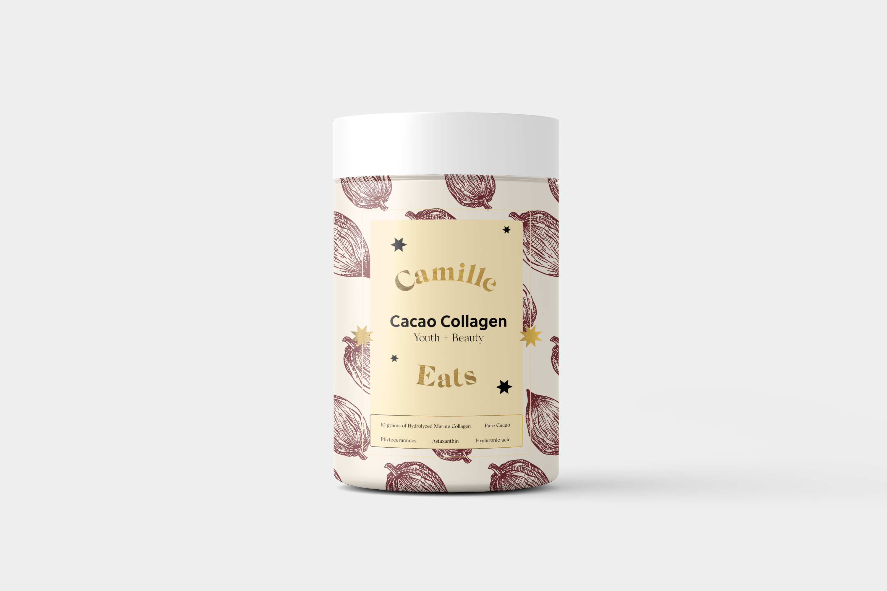
Camille Eats is a Spanish collagen powder brand that wanted to stand out and communicate more of a lifestyle rather than supplement feeling. The logo is feminine, dreamy and applied on vintage-inspired patterns. This is a project that got cancelled mid-way.
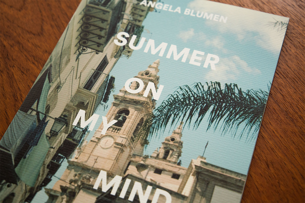
Summer on my mind
Publishing, Curation
2022
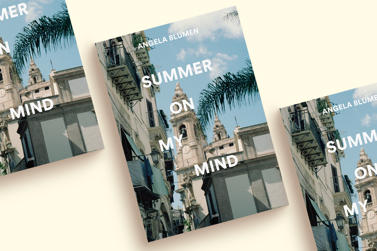
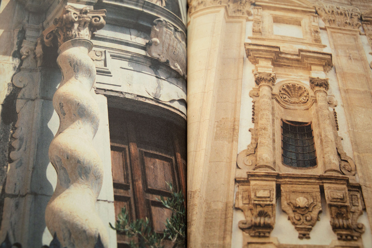
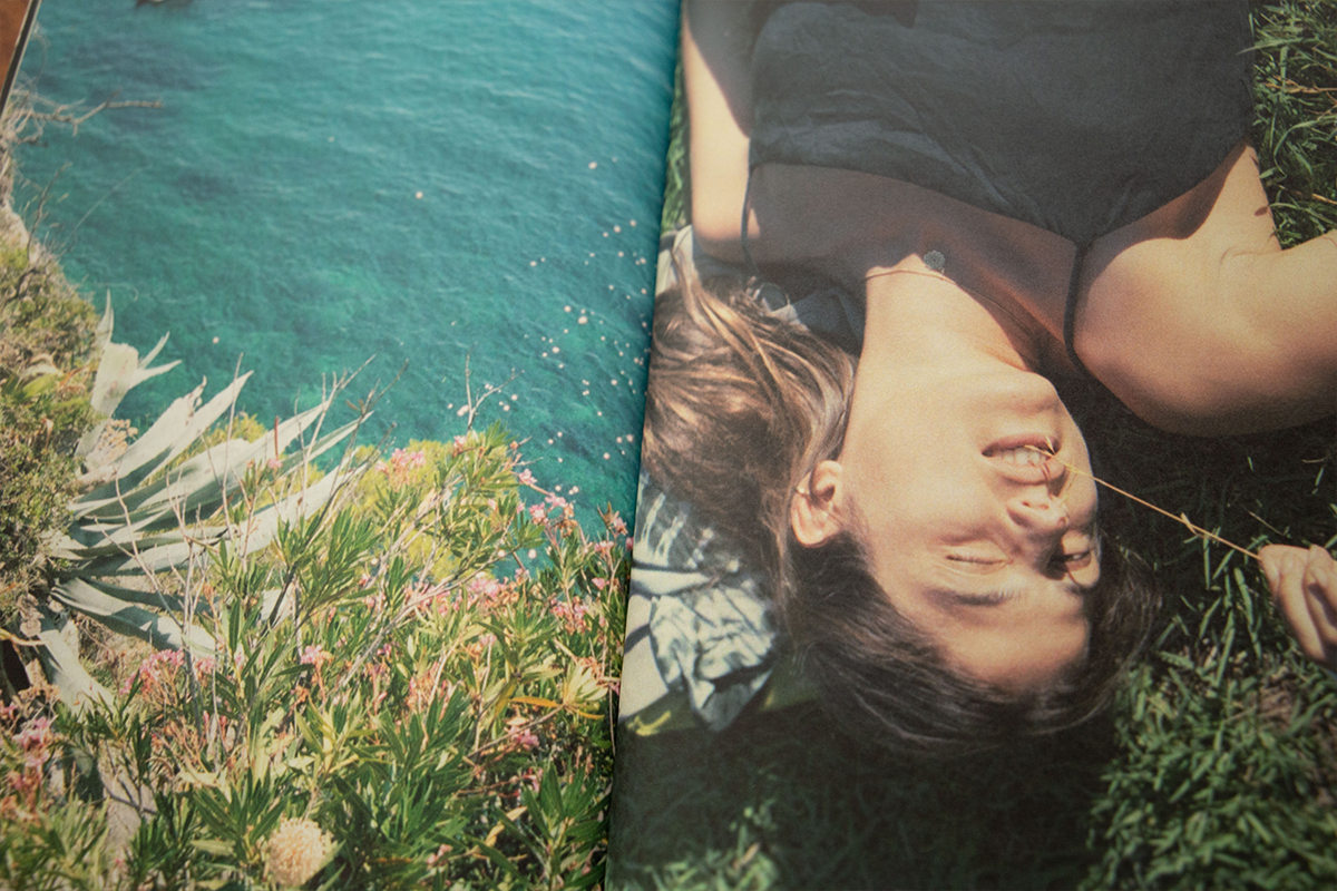
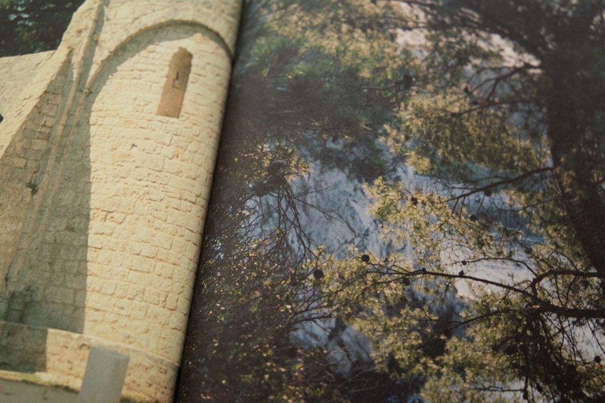
A collection and curation of my own analog photography taken during the course of summer 2022 around the Mediterranean area. I had a little launching party at The Collection One in Amsterdam in November 2022. Printed on Munken Paper in Amsterdam. Still available for purchase here.


